- Follow us:


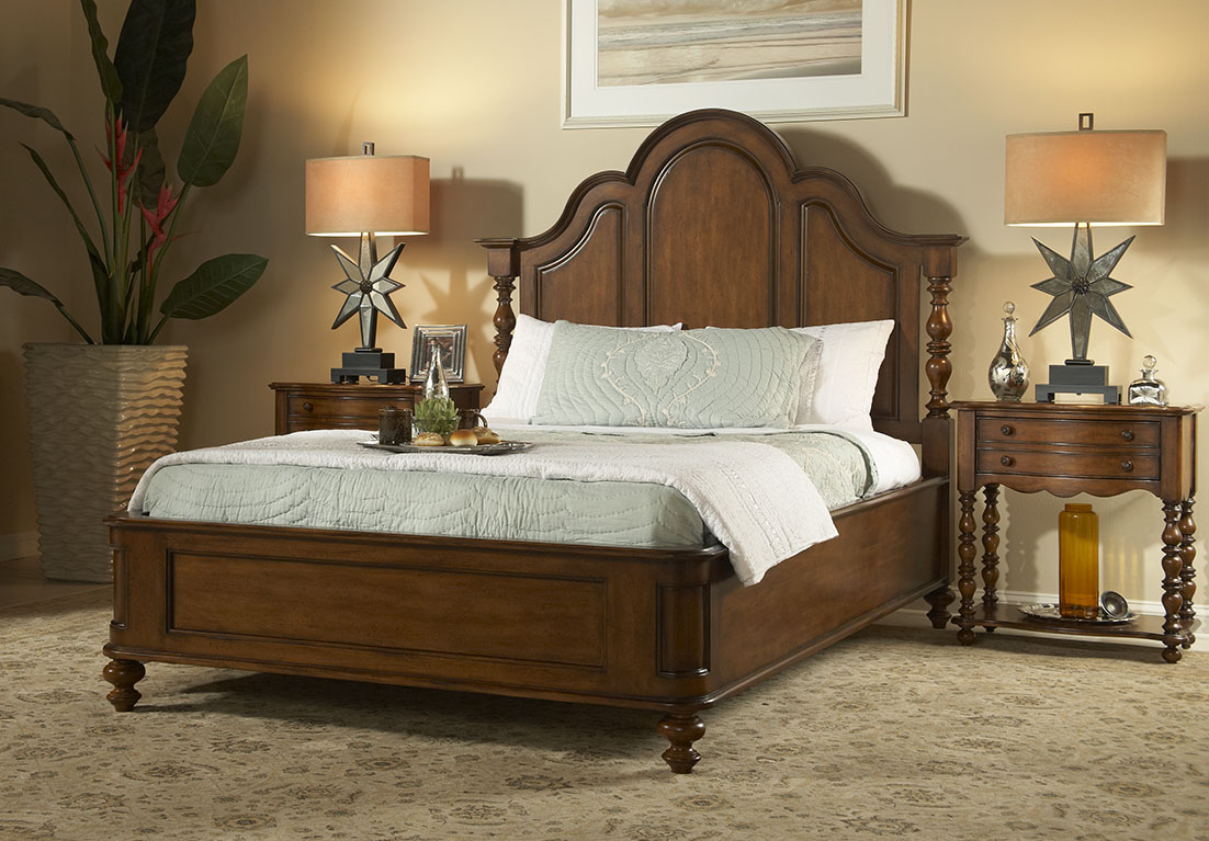
FFDM Summer Home Collection: The unifying color in this traditional bedroom is brown in different shades.
Color preferences vary per person, per personality. Some folks like it bright and daring, some feel more secure with neutrals, still others like to experiment. The good news when it comes to using colors is that there is no such thing as a correct palette.
Have you ever gotten inside a home where there is an explosion of colors only to feel that every room seems to be detached from the rest? What’s missing here is what’s referred to by interior designers as cohesion.
The Cohesive Paint Color
A simple way of creating a more cohesive feel is to have color consistency on walls. Connecting spaces, in particular, should have paint color that will harmonize them. This is especially true in an open floor plan.
This does not mean that you should automatically resort to gray, white or beige. You can still use a color that suits your preference so long as the hallways, the foyer and the main connector room are all painted in the same color. The color that you use there will serve as the dominant color in your home.
Plan the Color for Sightlines
People who want variety in their wall colors should pay more attention to sightlines. These are those areas when you are standing inside the living room and you get to look into the other rooms. A clear view of the dining room or the kitchen from there means you have to paint these three rooms with the same paint color. The key here is for all three rooms to work together. Paint them in different colors and what you’d get is a weird look that simply won’t work.
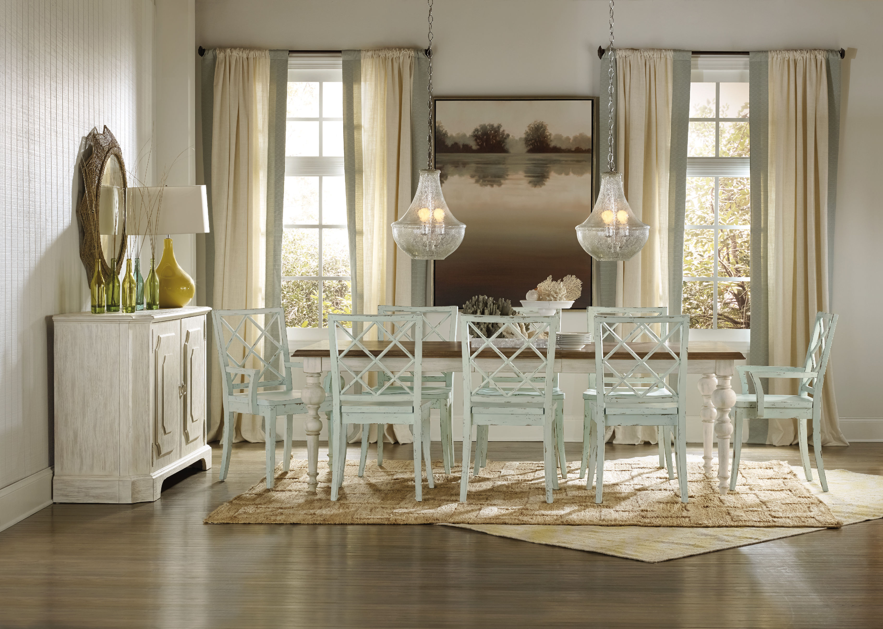
Hooker Furniture Dining Room Sunset Point Rectangle Dining Table with Two 18in Leaves
Pick Color Groups
Just as you are admonished to choose your friends well, this is also the case when it comes to choosing your color gang. Your color scheme must effortlessly flow from one room to the next. To achieve this, make sure that you get colors from the same temperature family.
Some people choose to work with the warm color palette, others the cool color scheme such as the blues, grays, and greens.
Another option is to pick one or two hues then use variations. If blue happens to be the main color, then you could pair it with gray-blue or you can always go with pure blue which shifts to navy blue as you move from one room to the other.
This same concept can be used in using decorative accessories.
As for your wall paint, paint stores can provide you with tint of particular colors. Your chosen main color can be knocked down to about 50%; all the mixer has to do is to add more white each time. You can go lighter or darker with the main color that you choose.
Walls should be painted two to three shades lighter than the ceiling color. This won’t look stark when you decide to use white.
Paint decks are also great inspirations in finding colors that harmonize.
Edgy Colors, Hid
Rooms that are out of sightline are great places to experiment on in terms of wilder colors. Powder rooms, master bedrooms, kids’ rooms, and other rooms that are encased in four walls are places that you could colorfully indulge.
So, have you always wanted to paint a room black? Begin with the bathroom!
Bold Colors, Cute Accessories
Accessorizing is an easy way of introducing dramatic hues. Limit the bold colors on your accessories, this is if you’re still uncomfortable about the whole switch from neutrals to bold colors.
Choose a color that will excite the senses, bright colors are great in highlighting a thing or worth.
Tie the rooms with accent colors that alter from room to room, though continuing with the major color throughout. Blue and green in the living room, for example, will mean using one of these colors inside the dining room. You could do blue and yellow in the next room.
Always keep the colors cohesive so that your theme would make more sense to you.
Follow us on our social media
© McCreery's Home Furnishings | All Rights Reserved | Privacy Policy