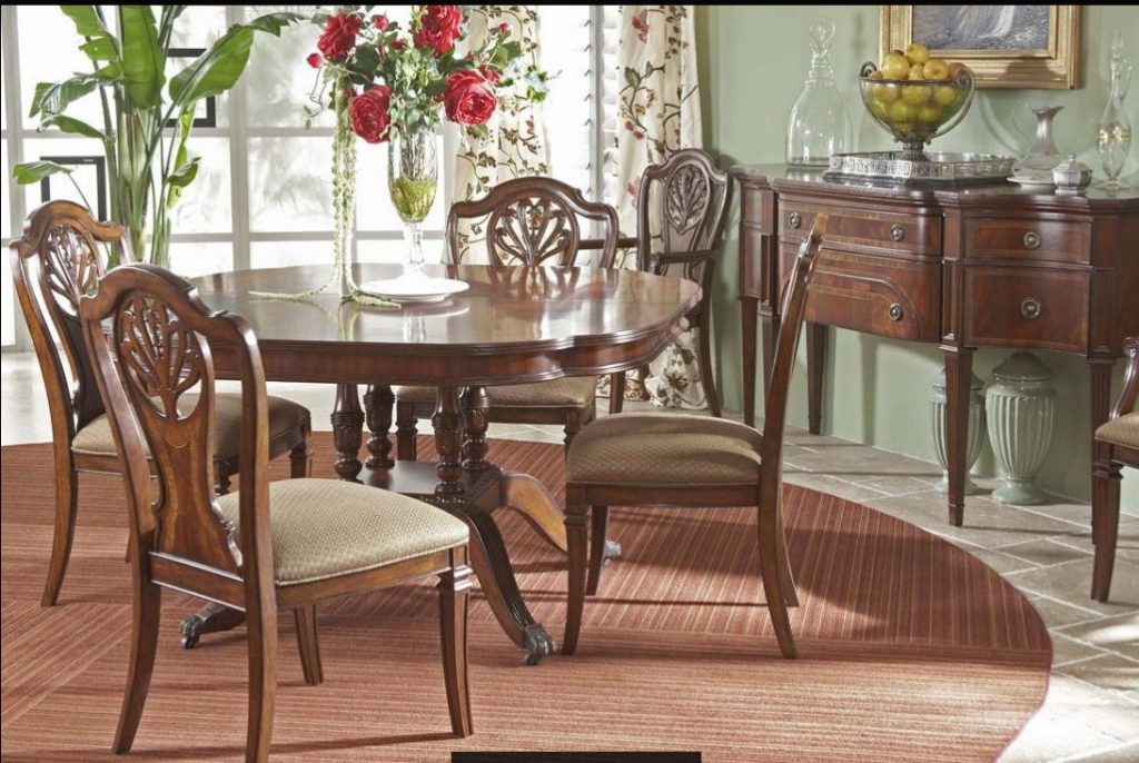
‘Notice the contrast of this Antebellum collection against the tamer backdrop?
There are many principles to talk about when discussing interior design. But when organizing and designing, it is a wonderful tool that you can use effectively. But, first, let’s define color contrast.
If you are to define contrast in interior design, this is the difference between two hues – that is all there is to it. When you’re building a webpage, though, it becomes an entirely different thing. You would want to have a high contrast between the background color and the text. High contrast between interior design elements could give a messy look. Yet black and white is the highest contrast that can be created.
Contrasting Colors
Colors may contrast in value, hue and saturation yet color theorists have come up with different kinds of contrasts through the years.
Hue contrast is as simple as saying high contrast or low contrast. This relates directly to the fusions on the color wheel. The farther each color is from each other, the higher their contrast becomes. Complementary colors have the highest contrast while the opposite is true with analogous color combinations.
A special contrast of hue is the so-called cool and warm colors. These depend much on how the eyes work. Warm colors appear closer while the cooler ones are more distant.
Contrast of value is best in the creation of bigger contrasts. Black and white is believed to be the highest contrast of value. Huge differences in lightness are pleasant to the human eye. Lower contrasts on value can be used on subtle differences.
Saturation contrast is best used in designing aspects that don’t require emphasis. Color sets with varying saturation that are set against a gray background, for instance, is seen as transparency. This is an interesting piece of design aspect.
Decide which part of your home you would like the color contrasts to take place. Imagine a pastel sofa surrounded by other pieces of furniture in jewel tones. These will make for a wonderful rendition of successful color combination.
You could be tempted to keep the walls white but try saffron instead. When combined with green tiles, the saffron wall would create a more interesting visual thing to look at.
Blue and reds, grays, oranges, greens and yellows can be combined as warm and cool tones. They can be used to balance the ambiance, to make cozy, or to create drama.
Contrast in Composition
When talking about color contrast, this generally refers to a number of color fusions yet it is not limited to these. Textures can also be contrasted with the right set of hands. Shapes can, too, though this is rarely done. If you want to start using shape contrasts at home, then you can look for geometric or boxier pieces and start mixing them with round or curvy pieces of furnishings.
Going back to colors, you can also add a pop of color to any colorless space so you can perk it up or give it a more interesting dimension.
Dark blue walls and turquoise blue may be close on the color scale but they can still appear different. These colors just prove that even almost similar colors can be perceived differently. This example of color combo can also be used as an exciting pop of color in a room where you would want some activity and increased productivity.
Juxtaposition is also about experimenting with visual interest. This means being comfortable in mixing lighter oak with walnut or granite countertops with walnut cabinets.
A Contrast Room?
When you want a bright, white home, having a dark more mysterious room might be a far out idea. Not in a home where contrast is being set up. How about having the guest room in dark color while the rest of your home swims in a lighter hue?
© McCreery's Home Furnishings | All Rights Reserved | Privacy Policy