- Follow us:


Friday, April 26th, 2019
The Hamptons style has taken the world by storm and it’s easy to point out why – just look at the airy palette, the freshness of the spaces, the beach vibes at times, and all the natural textures and you’d fall in love with it straightaway.
The Hamptons design is inspired by the décor and architecture of luxurious buildings and holiday homes in many seaside communities along the beaches in the east and the upstate Long Island habitats.
The Hamptons interiors display a relaxed setting, mostly in a coastal atmosphere, with generous helpings of seating units from couches to recliners. Outdoor entertainment areas are also abundant.
Setting up your home with this style means you have to use white somewhere – or even everywhere. Build around this hue as you add interesting decorative elements and accents with bursts of colors and textures where they’re aptly needed.
The Hamptons provide comfort, a relaxed atmosphere, elegance, and classic furniture pieces. Taupes and blues are fused with shades of white or paired with metallic and wood accents for elements like lighting.
The Anchor

Hooker Furniture Couture White
The decorating palette for Hamptons is based on the crispness of white paint in a muted sheen finish. It can be modern or classic and in both times, it is welcoming. Use Vivid White or Dulux White to achieve the Hamptons elegance. The walls are always the best place to begin using white.
Glass is widely used to cover the expansive windows. They are often edged with timbers that are painted with a semi-gloss finish. Others come in aluminum frames or dolled up with plantation shutters.
The outdoor vistas in Hamptons homes are also common and these are brought forth by the charming bay windows, oversized French doors, or the louvered glass doors.
It is also advisable to pick white finishes for the cabinets in a Hamptons kitchen. Open shelves are most welcome or those with glass panes as cabinet doors. Be true to the light-colored hue that’s ever present with marble and some natural stones. Stools and bench tops can be dressed with white laminates.
As for illumination, stick with glass and metal pendant lighting.
The Layers
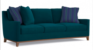
CYNTHIA ROWLEY FOR HOOKER FURNITURE HAMPTONS 3 OVER 3 SOFA: Don’t stop with white.
Hamptons style can also layer with the beauty of greens, blues, and other coastal colors. And those stripes? Truly remarkable.
Hamptons flooring is almost always timber floorboards while those who would want to switch to the style but currently have a different material could use any neutral-colored carpeting.
Pale or gray undertones, whether painted, whitewashed or distressed can all serve as amazing choices for that coastal breeziness that’s required in Hamptons style easy living.
Layer with natural fiber rugs such as sisal, jute or woven cotton. Bleached wool can also be paired with timber floors. If you like carpeting more than any floor covering, go for natural tones and basic textures that make you visualize driftwood and sandy shores.
The Style
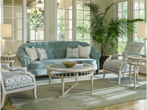
Protégé Upholstery: Distressed is also the name of the game. Here, weathered and neutral pieces perfectly frame the soft blue couch.
Protégé Upholstery: Distressed is also the name of the game. Here, weathered and neutral pieces perfectly frame the soft blue couch.
Pile the colorful cushions on top and add a bit of Chinoiserie, China blues, chintz, and coastal-inspired motifs. Textures play a pivotal part as do jute edges, beautiful linens, and piping that come in complimentary tones.
Experiment with vignettes all around your living space. The table tops are an awesome way to infuse task lighting together with plain linen shades. These can sit on top of glass or stone-based lamps, coffee table books, and china bowls.
Remember that throughout your home styling, there are blue and white hues, some light florals here and there, lace and geometric lattice patterns.
Talk of patterns, they can add a bit of personality to you subtle seaside look. Use patterns on curtains and cushions of gray or blue. Ikat and florals are also popular inside Hamptons homes.
And we’re not done yet – you can also introduce the East coast design with timber staircases and hallways. The trims must have exciting details like cornices, architraves and skirting.
A Generous Helping of Furnishings
Imitate this Hamptons look with Flexsteel Furniture.
Typically, Hamptons homes come with overstuffed seats dressed up with linen or washable slipcovers. Upholstered pieces in pale hues and stripes are also paired with side tables and sideboards that are also painted white.
If you like the look that’s offered by rattan or cane armchairs, then it’s easy for you to love the look that’s offered by Hamptons style. These materials are suitable in a relaxed and comfortable setting without sacrificing elegance.
Choose unique lamps, big sofas, and glass coffee tables. Let these pieces be inspired by the seaside neutrals, blues, creamy tones and greens. You don’t even have to worry about using the same hues, just be sure to set up colors that harmonize.
Hamptons Exteriors
The laidback look that Hamptons style offers isn’t just for indoor settings. You can also take the beach vibe outdoors by also being versatile and clean there. The key elements to consider include weathered tones and for those who like a sleeker style, deeper tones to mirror the streetscape.
There are many ways to set up the Hamptons exterior. Use the landscape as your anchor. Darker colors go with sleeker styles and in an urban habitat. The coastal home, on the other hand, is more suited with weathered and softer tones but with complex detailing.
If there is one thing that a Hamptons exterior must have, these are the weatherboards. Find the low-maintenance types which will provide the needful horizontal, clean shadow lines. You can paint or apply them over brick.
The simple rule outdoors (just like indoors) is to capture the essence of embellishments such as window trims, pillars and balustrades. Finish the look with decorative window trims.
Tags: Hamptons, Hamptons decor, Hamptons interior, Hamptons interior design, Hamptons style, McCreerys, McCreerys Home Furnishings
Posted in Color Schemes, Interior Design 101, Interior Design Elements, Interior Design Themes | Comments Off on Hamptons Styles to Emulate This Summer
Friday, April 19th, 2019
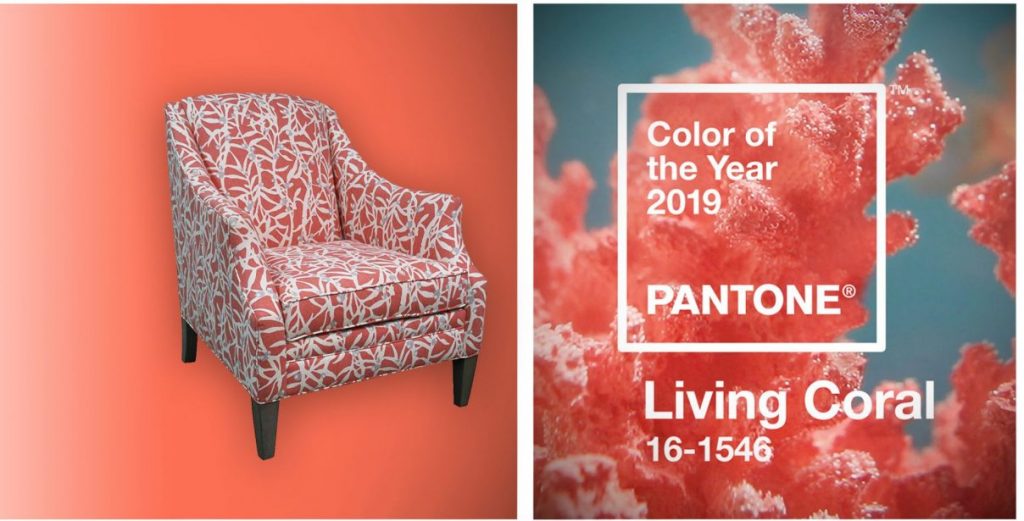
Living Coral on Sam Moore Furniture.
What a wonderful year 2019 is, and what an amazing Color of the Year Living Coral is. Pantone’s chosen Color of the Year for the Year of the Earth Pig is the vivaciously delicious Living Coral.
Living Coral is fearless and upbeat but, looking at it, it is now a classic since it offers a Renaissance vibe. If you’re feeling up for a remodel so you could use this color for this year, then you’re not alone. A lot of homeowners are concocting ways to use this hue in their habitats.
Go ahead and liven up your home with this exciting color. Imagine different ways that you can pair it, fuse it or make it the center of all attention.
Living Coral + Gray
You can wake up to the awesome coolness of a neutral color palette as you set up a pearl gray loveseat. With light woods and off white walls all throughout, the welcoming freshness of Living Coral is something to look forward to in this setup.
Living Coral + Rich Blues
Living Coral will also blend well with royal blue. These are complementing colors that can make your space look regal. If you have dark woods and some gold accents, then what you’ll have is a dramatically sophisticated living room – or is it a bedroom that you wanted for this display of colors?
Pairing Living Coral with teal or aqua is also an alluring way to set up a beach vibe in your home. Use this color palette to make the living room or dining room more exciting.
Living Coral Going Solo
Living Coral, by itself, is already a vibrant color. So, it can manage to become a classic or modern element in any home. It can be the accent hue in a shabby chic environment or it can be the stylize a modern habitat.
You can even achieve an Asian flair with the right elements matching this lovely color. Living Coral can be used in bigger swaths throughout the room so that it stages an inviting and friendly environment.
Living Coral as Accent
Small accent pieces may be tiny but the can contribute – a lot – to the overall harmony inside a home.
Use Living Coral inside the bathroom to give it a different level of freshness. Use it in the bedroom to give a dash of bloom into that restful space. If you use Living Coral in the dining room or the living room, then you have sprinkled those rooms with tasteful art.
Color dispersion is the key to successfully using this lovely color as an accent hue. With the Pantone Color of the Year used in small amounts, you are keeping your spaces from looking too busy or confusing.
Pops of Living Coral will also provide an uninterrupted flow to the different rooms, thus, maximizing the impact of your design.
Living Coral Is Fun
What could be more fun to use in a home this year? Celebrate the beauty of interior design by choosing Living Coral as one of the stylish elements in your home. This bright color fuses the masculine and feminine energies.
In essence, you are decorating with Yin and Yang in mind or the ultimate balance. This will then become the oasis that you so badly need especially this season and the upcoming warm summer.
The Living Coral Overall Effect
Living Coral is fun. It can be the star or the relief from the overall color scheme. It can be bold, it can be the calming hue, it can be so many things for as long as you know how to use, fuse, and appreciate it.
Tags: 2019 Color of the Year, Living Coral, McCreerys, McCreerys Home Furnishings, Pantone Color of the Year 2019
Posted in 2019 Trends, Accents, Accessories, Color Schemes, Decorative Elements, Interior Design 101, Interior Design Elements, Interior Design Themes | Comments Off on Living with Living Coral
Friday, March 22nd, 2019
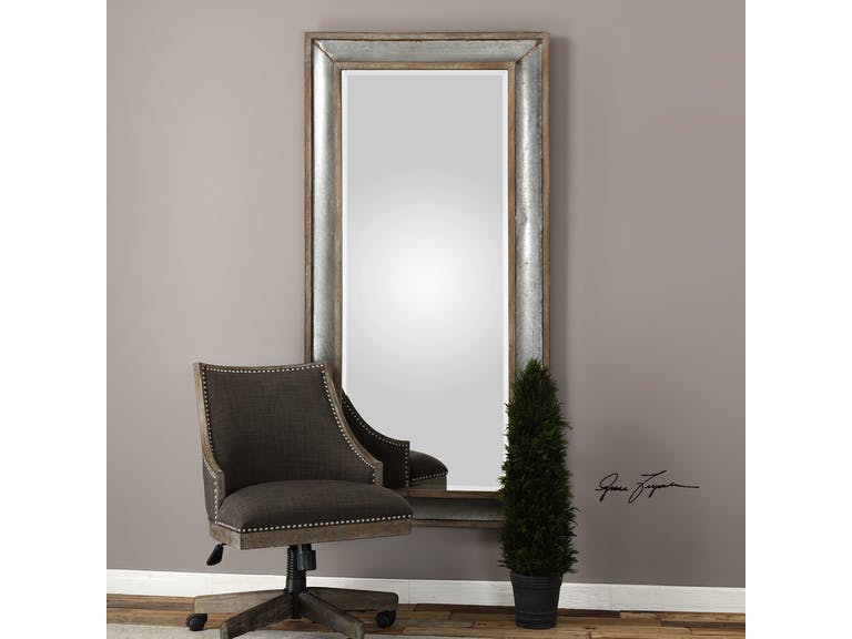
Uttermost Accessories Texoma Galvanized Tin Mirror 09314
Tin is a chemical element; it’s a silvery metal when it is refined. It is known for being able to resist corrosion. It is also being used to coat other metals and as a plating on steel sheets. It is also the main material for cans.
Tin can also be combined with copper and the resulting metal is a kind of bronze. Fuse it with lead and what you form is solder. A tin compound is also a common ingredient for toothpastes as it is effective in tooth decay prevention.
A Little Tin History
The earliest records of tin dates all the way back to 3500 B.C. in what’s now Turkey. It was there that tin was first mined and then processed. The ancient metal workers used it together with soft copper which led to a more durable form of bronze. This metal was then used to create weapons and tools because they were much more durable and were able to stay sharp for a long time.
The discovery of this kind of bronze spurred the beginning of Bronze Age. This era lasted for about 2,000 years. After this, tin deposits – lots of them – were dug up in England and the traders eventually brought it to Mediterranean countries. Their source was kept secret, though, and it was not until 310 B.C. that Pytheas disovered the mines’ locations.
The Chinese and South African peoples used tin as did the metal workers of Thailand who also mixed tin with copper. By 1600 BC, bronze plows were already being utilized in Vietnam.
Fast forward to the early 1800s, Pierre Durand from France patented his method of food preservation. This was sealing food in tinplate cans. Bottles were quickly replaced by the mid-1800s and by the 1830s, alloy bearings were already being used in high-speed machinery and transport developments.
These days, tin is widely produced in Australia, Bolivia, England, Indonesia, Malaysia, Nigeria, and Thailand. The United States has no known major tin deposits.
Tin in Interior Design
Metallics are widely used in interior design for the last years. Gold, brass, silver, and chrome are shining supremely in homes as they are mixed and matched with every possible interior design element.
Metallics have made it to the elite in terms of style. Tin as made it to this circle as it is now one of the trends for 2019. Pinterest was bold enough to declare that tin will be big this year. The searches for this metallic material has risen to 563% each year.
It has definitely captured the hearts of many homeowners and interior designers. Touches of tin can effectively add personality and spunk in different spaces throughout your home.
If you want to use tin in the bedroom, then have it as an accent wall. Use patterns and textures to make this metal even more interesting. Create an industrial look effortlessly with this material.
Consider adding complementary materials like pewter, silver, chrome, copper, and even ceramic tiles.
If you’ve decided to use tin on the ceiling, then you can do this in your dining room or kitchen. Pick a shiny kind of tin so that light could be reflected throughout the room. This could brighten up the space as you cook food or serve the meals to your family.
Tin is an instant urban accent. It can be your corrugated, focal wall in the living room. add pops of bold hues such as orange to make the room even more interesting.
If you’re not ready to commit, full-time, to the installation of tin or any metallic sheets, then that’s fine. You could begin with the tin headboard or a tin planter outdoors. There are also tin-colored wallpapers to try first so you can have a feel of how tin will beautify your home.
Tags: McCreerys, McCreerys Home Furnishings, tin, tin elements, tin in interior design
Posted in 2019 Trends, Accents, Color Schemes, Decorative Elements, Interior Design 101, Interior Design Elements, Interior Design Themes | Comments Off on Tin Is Absolutely In
Monday, March 4th, 2019
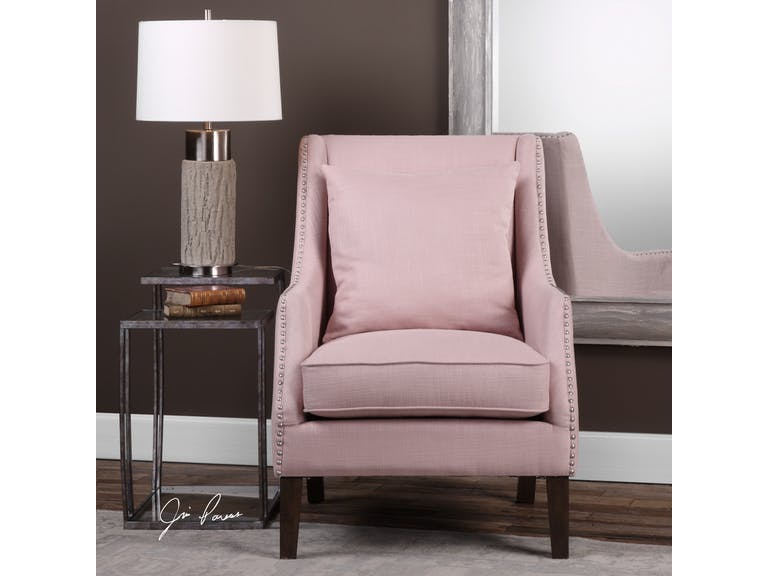
Uttermost Living Room Arieat Pink Armchair 23370: This pop of pink is just the needed visual interest in this neutral room.
Pantone is a company that prides itself in being the global authority when it comes to color. For many years now, it’s been unveiling its versions of Color of the Year and it seems that the fashion and interior design industries are following the trends.
In 2017, the Color of the Year was Greenery and just last year, it was more eye-catching with UltraViolet taking center stage.
Did you ever wonder how Pantone chooses the colors that they highlight each year? They have been at it since the year 2000. It all began with the discussion among 20 people and it eventually evolved into a team which became the Pantone Color Institute.
The process of choosing the subsequent year’s central color takes almost nine months. The chosen color is actually a global expression of people’s moods and attitudes.
Following the color trends isn’t new. Homeowners want to stay up-to-date with the current styles that they could use in their own habitats. And two months into this new year, you have ample time to understand this year’s color and how you can apply it in your interior design.
Living Coral in Your Home
So Pantone has finally proclaimed this year’s color to guide the decorators, designers, and homeowners with their color schemes. Current events pointed towards Living Coral, an exciting yet subdued pink that would be great to incorporate in any design.
UltraViolet, last year, promised that it would point to what’s about to come. Many people did not know how to use this eccentric color. It became a trial and error of sorts for some.
Pantone stated that Living Coral is meant to energize and it is familiar because it is a hue that’s commonly found in nature. More specifically, this color is displayed beautifully underneath the seas so very few have enjoyed its actual beauty. A lot of designers are excited to use this rare hue in their homes.
Living Coral is vibrant and charming so it could bring just these beautiful adjectives to your home. You can either use it as a bold statement or it can also take the backseat to become the light accent.
Allow Living Coral to participate in the whole design harmony that you’re trying to set up in your home. And allow yourself to be playful, too, as you experiment on how you can better use this lovely hue.
So, Living Coral is, somehow, a shade of pink. What’s great with this hue is that you can match it with many different colors. Even when it’s categorized as a shade of pink, it’s a mellow version so it is nearer the neutral plate more than any other color scheme.
Living Coral does not have to be used in a totally pink home. Match it with whites, grays, creams, greens or blues. These complimentary colors can help neutralize the pinkness.
Add a partial or full accent wall then pair the color with pure white and natural wood. This simple ensemble will give you a contemporary vibe. If you’re not afraid to play with colors, then go bold with the Living Coral being the anchor color for metallic accents.
Living Coral can be so beautiful inside the bedroom. It can be used as the color for the bedding or the furniture. This hue would surely bring restful sleeps in the nights to come.
If you want to add Living Coral in the kitchen, then add it to an all white space. The pop of color will add the fun vibe to what is an otherwise neutral room. Imagine a Living Coral colored set of coffee mugs and kitchen towels.
They’re a thing of beauty, aren’t they?
Tags: 2019 Pantone Color of the Year, Living Coral, McCreerys, McCreerys Home Furnishings, Pantone color of the year
Posted in 2019 Trends, Accents, Color Schemes, Decorative Elements, Interior Design 101, Interior Design Elements, Interior Design Themes | Comments Off on Making Living Coral the Focal Element of Your Home
Tuesday, February 5th, 2019
The Uttermost Living Room Royal Cobalt Blue Accent Chair pops from the neutral and dark fusion on its background.
There are many different parameters that help shape design. If one would look at each one’s design, everyone has a preference or taste that’s distinct. Even the relationships that each person goes into are indicative of his or her qualities and perspectives in life. At the bottom of it all is each one’s personality.
Each individual’s personality is the catalyst to an environment, emotions, even the ups and downs of his or her life. This is the same force that repels or attracts other people. Personality almost always dictates ever aspect of a human’s life.
Color is the best way to add unique touches in anyone’s home. It is known to have a profound effect on people’s emotions and moods. Putting bright colors in your interior design can help create a jovial atmosphere.
If you’re willing to go way beyond happy, then you can be playful. Neon shades are the boldest. You can also make use of a feature wall or splashes of hues that are strategically situated. Practically any room can have neon hues or any vibrant colors, it’s all a matter of knowing how to use them.
Lately, modern interiors have been showing a lot of bold colors. The key here is to have restraint no matter how the colors might excite you. Too much of any color isn’t going to look right. Sometimes, all it takes is a hint or two on the furnishings or textiles and you will achieve the ideal.
Here are more ways that you can use bold colors in your home –
Be Familiar with the Color Wheel
If you’re going to use bold colors, then be familiar with the color wheel. This tool can help you pick the right colors for your interior design. The 12 shades have been arranged and divided into cool and warm hues.
The cool colors include shades of blue, turquoise and violets. The warm shades are the red shades and oranges.
Analogous colors, which are placed right beside each other on a color wheel, tend to work well when they are fused. These are the best colors to harmoniously blend everything else in the space.
Consider also the tone and saturation of the colors that you pick. The saturated shades tend to be more vibrant while the less saturated hues are the muted versions of a basic color.
Apply the 80:20 Rule
This rule is crucial when you’re designing. This basically means that 80-percent of the room should be kept neutral while the rest, at 20% must be bright-colored. This is the technique in creating a statement in a way that’s just enough so that the look isn’t ruined.
An example of this is when muted gray and yellows are used on the walls as the sofa is a bright lemon hue. This is an interesting contemporary statement.
If you’re a bit cautious in spending your hard-earned money on colorful pieces of furniture which you may end up regretting, then it’s okay to begin with less of a commitment.
You can always go with a neutral couch that’s highlighted by bright-colored throws. These pieces will give you the same boldness without committing too much. Should you decide to push through with the furnishing investment in the future, at least, you saw and felt how it was to have bold colors in your home in a non-pricey way.
Light and Shade
If you have a home that’s filled with daylight, then all you have to worry about is to look for dramatic tones that will serve as accents. Whichever colors you end up choosing, strive to design the space in an inviting manner and never shocking.
Tags: bold colors, bold hues, bold interior design, bold interiors, McCreerys, McCreerys Home Furnishings
Posted in Accents, Color Schemes, Interior Design 101, Interior Design Elements, Interior Design Themes | Comments Off on Are You Daring Enough for Bold Interiors?
Monday, February 4th, 2019
The American Leather Living Room Ainsley-Sectional may not feature the bold retro colors but its sleek legs and slim look are retro necessities.
The American Leather Living Room Ainsley-Sectional may not feature the bold retro colors but its sleek legs and slim look are retro necessities.
Retro style covers many design decades. This term was used in the past as a means to describe styles and trends that were in. If this were to be the basis, then every style eventually becomes retro. At this time, styles that are from the ‘50s, ‘60s and ‘70s are considered vintage, therefore, retro.
If you’re willing to cross over to any of these interior designs, then it’s time to go retro. Always think of bright hues, bold designs, and an awesome flair. You have to be daring because retro requires a certain set of personalities. It is far from laidback or casual; it’s busy, even bordering funky.
Retro Hues
To be truly retro means you have to pick retro colors. Don’t worry, this is not difficult to do.
Begin with avocado green. This is the retro hue of choice followed closely by mustard and fusions of black, brown, red, and white. Hot pink and purple are also amazing additions to your retro style home.
You can place a little of everything and mixes of green, blue, indigo, orange (the bright type), and sunshiny yellow. Checkered patterns are also welcome as are tie-dyed fabrics and paisleys.
Retro Textures
Texture is an element that you must never ignore when it comes to retro designing. Here, in fact, it’s okay to go overboard. Use soft vinyl, shag carpets and crushed velvet. Keep in mind that you have to be bold about everything so go ahead and use a lot of textures.
Retro Accent and Flooring
Here’s another easy thing about retro – you don’t have to limit your use of accessories and accents. Retro pieces include door beads, rugs, lava lamps, stools, and skate tables. Sculptures and art are often unique and bold, could also be abstract.
As for the flooring, your options are these three – shag carpeting, tiles patterned like checkerboard, and natural wood.
Retro Lighting
Every retro style home must have its floor or desk lamps. You can also opt for a multi-colored chandelier.
Retro Furniture
Now this is one design element that we have to focus on when it comes to retro style. The pieces that you choose are crucial in creating the retro feel in your home. Get the wrong furniture and you’re looking at a totally different or awkward era.
Broad and long sofas are a must. These must also be decorated with different-colored pillows for the needed burst of color. Chrome barstools are also a wonderful addition (especially the ones that have a red seat) to the kitchen or the bar. Puzzle piece ottomans offer a unique seating option for your guests.
It’s no surprise that retro furniture is still much wanted nowadays because its simple base constructions and wooden structures with metal feet are difficult to ignore.
If you’ve seen the Bauhaus style, then you’d know where retro style gets its influence. With this style, quality is a must for each furniture piece while still not steeply priced. Add in the element of comfort and you’ve arrived, style-wise.
Just imagine the milling techniques back in the 1960s till the 1970s and you know that you should include a bit of the perforated hole design and the metal fronts. Filigree legs provided the light and comfortable look that’s a recipe for the perfect retro home.
Going further on your furniture choices, use tables and side tables with a metal or solid wood construction. A gilding of metal is also a great addition. For the cloth covers, use sea green, musty yellow, brown or beige. Muted orange also appeared during the ’50 till the ‘60s so that’s also an option.
Don’t be afraid to mix different materials so you can say that you’ve truly jumped into the retro bandwagon.
Tags: McCreerys, McCreerys Home Furnishings, retro, Retro design, retro interior design, Retro style
Posted in 2019 Trends, Accents, Accessories, Color Schemes, Decorative Elements, Furniture, Interior Design 101, Interior Design Elements, Interior Design Themes | Comments Off on Retro Interiors Made Trendy
Tuesday, January 22nd, 2019
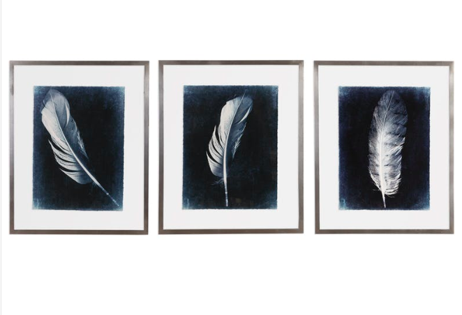
Uttermost Accessories Inverted Feathers Prints come in sets of three.
Are you one of the folks who think on default that dark-colored rooms are depressing and gloomy? A few people could even feel claustrophobic. Using dark hues takes getting used to but those who are able to overcome their initial negative reactions appreciate the coziness and drama provided by the dark colors.
Interior designers have a lot of techniques and tools in beautifying homes. Some of these depend on their personal taste as well as their professed signature style. Other designers prefer thrive on traditional wisdom. One such conventional notion is that dark colors can help recede objects in a room.
Here are other ways that you can wield the dark colors –
Emphasize a Photo
Do you like black and white photos? If you answered yes, then it’s time to think about changing your wall colors to black, say, a delicious matte charcoal gray paint. This will recede in the backdrop which will give emphasis to the framed photos. The black and white photos then become the focal point in the room.
Stage a Light Show
Did you notice that the darker the sky gets at night, the more stars you are able to see? Consider light as a kind of black and white photo that becomes even more beautiful when placed against a dark backdrop. Consider increasing the striking features of light fixtures with a dark, rich hue.
Highlight Millwork
Cloak your walls in dark color so that they recede to the background and would bring the finest millwork foreground. This is especially effective if the millwork is painted white.
See Fabric Beauty
Your furniture’s upholstery does not have to be neutral-colored to stand out. All that it needs is a dark background and the furniture will be more striking than you originally perceived it.
Decrease Visual Weight
Using a bold, dark color as the anchor element in a room will help clear up misgivings. An example is when a kitchen island has a black marble or granite top that’s lacquered to perfection; having this placed in the middle of the room will emphasize the openness of a kitchen.
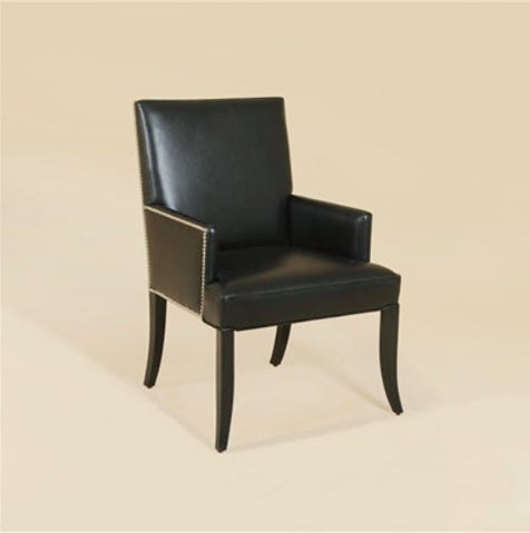
Maitland-Smith Dining Room Armchair, Lthr:Hair Hide
Alter Perspectives
You can also easily change visual perspective when the surface of furniture is a different color from its base which blends with the color used on the flooring.
If there are also structures which you do not want to veer the attention to, then it goes without saying that the color it should be painted with is black or any other dark color. This will allow the said structure to effectively recede to the background.
You can also conceal a television set when you set it up against a dark wall.
Remember that you can easily minimize and downplay any features in your home if you use dark colors on an already dark backdrop.
Unify a Room
Dark colors are not just interesting. They are also great to use when unifying different elements coming from various eras. These are the go-to colors of eclectic individuals.
Dark walls, furniture, and window treatments can unify the disparate design elements while creating a stylish look.
Create Contrast
It is crucial to create contrast inside a dark room. You need to learn to mix materials and play with varying textures in fabrics against hard surfaces. Use items that would pop against the dark-colored walls. Use bold or light colors sparingly and find interesting shapes, too.
Dark rooms are already innately dramatic so you should not overdo the use of black, navy blue, gray, and other such colors. Be careful in adding patterns, too, or you risk making the room look cluttered.
Energize
Believe it or not, dark colors can also energize. To do this, use glossy finishes on the ceilings, trimming, and architectural details.
Tags: dark color scheme, dark colors, dark design, dark hues, dark-colored hues, McCreerys, McCreerys Home Furnishings
Posted in Color Schemes, Decorative Elements, Interior Design 101, Interior Design Elements, Interior Design Themes | Comments Off on Stygian Hues: Embracing the Dark Side
Thursday, January 3rd, 2019
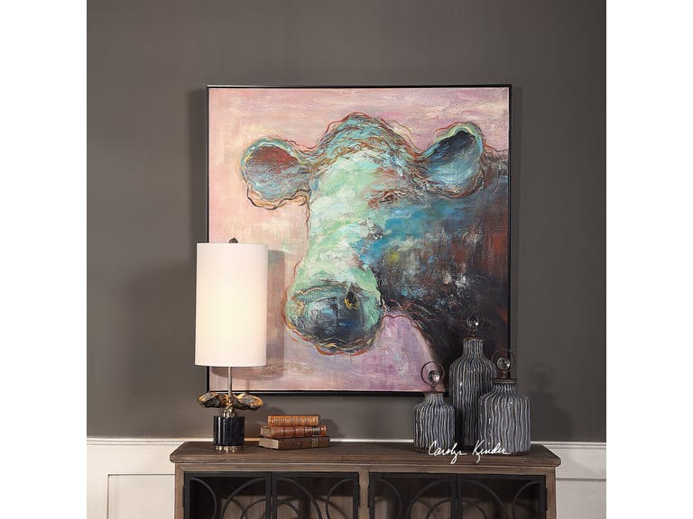
The Uttermost Accessories Matty The Cow Animal Art 41917 makes it easier to embrace this year’s Pantone Color – Living Coral. It is a more subdued version of the hue so it’s easier on the eye while still visually delicious.
The Pantone Color of the Year is both vividly bold and soft; it can be warm and comforting while, at the same time, beautifully buoyant. Get ready to welcome – Living Coral.
Also known as Pantone 16-1546, Living Coral is a spirited and appealing. Those who have a playful attitude and spirit will surely love this delicious color.
Living Coral, according to Pantone, represents the harmony between modern life and nature. It is also the color of the liveliness of social media.
Pantone Color of the Year: The Beginning
For 20 years now, Pantone has been influencing product improvement and has affected many purchasing decisions in varying industries including the world of fashion, industrial design, and furnishings.
The selection of the color is a thorough process that includes many thoughtful decisions and analyses of trends. This trends analyses could include looking at films, travels, works of new artists, artworks, and many other areas of design.
Other influences include textures, new technology, and social media platforms.
Pantone Color Institute is the unit in charge of emphasizing trending runway hues and color forecasts. This Color Institute works together with global brands to sway the psychology and color emotion in design strategies.
Let’s Use Living Coral
There are five color palettes that could fuse well with Living Coral. Use these and you will surely bring out the flexible nature of this beautiful shade.
The first on the list is Pantone 15-4003 or Storm Gray. Gray is a subdued color that will tone down the bright nature of Living Coral. Gray is there to create balance.
Pantone 19-5230 or Forest Biome. Forest biome is actually a term used to generally describe coniferous forests, mixed leaf forest and deciduous forests. The three types that are classified according to latitude are temperate, tropical, and taiga or Boreal forests.
This delicious green will further excite the vibrant Living Coral so it is awesome for rooms that are in need of energy and activity.
The next set of hues that you can partner with Living Coral is Martini Olive or Pantone 18-0625, Mauvewood (which looks relatively close to this year’s Pantone Color), Twill, and Beluga.
Now, don’t be afraid of this mellow color. This orange peace shade is perfect for people who are optimistic. It is a hue that promotes happiness, integrity, self-respect, longevity, to name a few.
Stress reduction is also a known benefit.
Living Coral is vibrantly fresh so you can use it in rooms that need to be energized. This can be used on bathroom tiles so that the room looks more refreshing. If used as a focal point, it can be painted on a wall to draw attention. This feature wall will surely become a classic so use it when you want the room to become an instant hit.
How about a Living Coral rug? Any dreary space is sure to come to life if this is the color that you’d choose.
It can also be the color of a major piece of furniture. Now picture this – a room with pink walls that is perfectly balanced by the furnishings that come in the darker shade of Living Coral.
Since this shade can also be playful, you can use it in the hallway or in kids’ playrooms. Pair it with nude hues to create the perfect welcoming work. In the living room, Living Coral is the right accent that is the perfect companion to indigo and deep teals. It becomes a warm shade as it is paired with cooler blue shades.
If Living Coral is too vibrant for your taste, then try finding a lighter shade of peach. This should still help you embrace the trend.
Tags: 2019 Pantone Color of the Year, Living Coral, McCreerys, McCreerys Home Furnishings, Pantone 16-1546, Pantone Color of 2019, Pantone color of the year
Posted in 2019 Trends, Color Schemes, Interior Design 101, Interior Design Elements, Interior Design Themes | Comments Off on Living Coral: The Hub of Color Schemes This 2019
Tuesday, December 11th, 2018
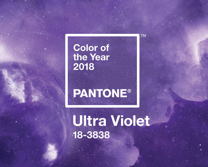
Credit: Pantone.com
Purple and its different shades are often associated with wealth, power, and royalty. It is no surprise that this year’s Pantone Color went high-flying-adored with its luscious UltraViolet shade. If you want to end the year with a bang, then why not redecorate your home with this lovely color?
From Tyrian Purple to UltraViolet
Purple was the hue worn by the magistrates of Rome. The Byzantine Empire’s rulers also regarded this hue to be the imperial color. The Roman Catholic church also has a high regard for it.
But where and when did purple begin?
The Old English word purpul derived from the Latin word purpura is where the modern term purple came from. The first recorded use of this word was in 975 AD. The Neolithic era showed the first prehistoric art containing this color. Sticks of hematite powder and manganese were used in drawing animals and outlining the cavemen’s hands (between 16,000-25,000 BC).
Violet sits closer to the color blue than purple. It is also a spectral color as compared to purple which is always a fusion of two hues.
Manufacturing the purple dye used to be a long and arduous process. It was also expensive to make since thousands of small snails were needed to provide the color needed. Tyrian purple was the standard color for royal personages, nobles, magistrates, and priests.
Purple is so beautiful that it was even mentioned in the Bible when God instructed Moses to tell the Israelites to make an offering blue, purple, and scarlet cloth. This Tyrian color varied greatly from a reddish to bluish purple.
The recreation of the Tyrian purple in modern times required 12,000 mollusks to provide just 1.4 ounces of the dye. This dye now costs more than 2,000 euros in our time.
Han purple became the synthetic source of purple pigment. This was invented in China at about 700 BC. It was then used on potteries and wall painting. This looked more like indigo and was often the result of the breakdown of the chemical Han blue.
French purple was born in the 18th century while the synthetic pigment Cobalt violet became available on the second half of the 19th century. In 1856, aniline purple or mauve was finally discovered.
By the 1950s, quinacridone became available to the market. While it was discovered in 1896, it was only synthesized in 1936 and manufactured in the ‘50s.
Accentuate a space with this Capel Incorporated Floor Coverings Panache-Ziegler Rug 3126RS Purple.
UltraViolet Winter
It’s the end of the year now but before you declare that UltraViolet is going to fade, make good use of it instead in your home.
UltraViolet has an energizing effect which is great because people have a tendency to feel depressed during the wintry months. This hue is so versatile that it can be fun and subdued at the same time.
You can make use of an UltraViolet accent wall before winter ends. None can be more enigmatic than this color for this year. This also provides a cosmic vibe to your home.
UltraViolet can also add the needed feminine vibe in the bathroom. ‘Want the tub to stand out? Have it in UltraViolet. This room has never been more majestic and mysterious at the same time. You can literally spend hours dipped in this exciting tub.
Sweet, soft, regal and proud – all these represent purple. So you can use vibrant UltraViolet as a blanket in the bedroom or as an area rug. It can also be the color of your walls if you’re feeling more adventurous.
Pair UltraViolet with creamy whites and you’d get a feminine vibe indeed. Fuse silver and white with it and it’s the perfect combination for Christmas.
Tags: McCreerys, McCreerys Home Furnishings, Pantone color of the year, UltraViolet, UltraViolet decor, UltraViolet in interior design
Posted in 2018 Trends, Accents, Color Schemes, Interior Design 101, Interior Design Elements | Comments Off on UltraViolet 2018: Ending the Year on a High Note
Monday, November 12th, 2018
The rich colors of fall are seen throughout this bedroom. Featured here are pieces Fine Furniture Design’s Regal Collection.
Each season comes with its spectrum of colors. The hues that you end up using in your home depend hugely on your personality. Fall probably has one of the most interesting palettes to offer with its deep browns, rustic reds, warm oranges, and deep greens.
As the weather becomes ever cooler and the outdoors show the most colorful delights, don’t you think it’s time to warm up your interiors with these interesting hues?
Huge Florals
What could be lovelier than this trend? And who says florals only have to appear during spring?
Find the blousy florals and put them on your bedding, cushions, and even as murals. You can then keep the rest of the design elements basic so that the flowers become the star of the show.
Hip Neutrals
If you can’t do florals this fall, then that’s fine. You can always create the modern look with neutrals. Be sure to emphasize your natural-looking furniture pieces. Be sure to focus on wood grains, stripped timbers, and natural patinas.
Team these up with neutral blocks and soft gray pieces for a more calming effect.
Gold Is In
Gold this fall? Why not?
Gold never goes out of style and it will always be in no matter what the season. You can use this as the statement piece or you can accessorize with this color.
This luxurious color gets its inspiration from the fallen leaves. From the pile of oranges and reds, you can also find gold, curled up pieces that can serve as an inspiration for your design creativeness this fall.
How about a gold carpet? The design possibilities are endless with this amazing color.
Black Is Back
The huge fans of the monochrome palette will surely love this color. This is all about the use of black accessories such as beaded pendants, a shelving unit with hints of this deep color and consoles in block color.
Combine black with textured pieces and its usual partner – white – to achieve a delicious design balance.
Bolder Than Ever
Many who design their homes during fall tend to imagine that they will use only the warm colors of leaves, wood accents and berries. But there is so much more that this season can offer in terms of giving life to your home through colors.
Have a beautiful burst of colors in your home this season. Add wild pink, plums, burgundy, and umber orange to your designs. And how about altering the accent wall with your chosen bold color?
Find the bold shades in different-shaped furniture pieces. Go for blocks to emphasize the boldness of the hues and use stripes and geometrical pieces.
Nostalgic Scandi Look
Of course, what would work would always be the classics. Get your design inspirations from the fall colors of sage green, neutral browns, beiges, and golden yellows.
These are not the same as the bright and invigorating hues of summer, though. Fall is the season that tells everyone to enjoy Mother Nature’s show. Whether you like the traditional upholstered pieces or versatile furnishings, you will always find a good use for subtle throws, interesting area rugs, and flower arrangements.
Don’t think that subtle is boring, though. The Scandinavian design could also become your inspiration for your interior design this season. After all, winter isn’t far away and the Scandi colors are perfect even for the upcoming winter.
Recreate a nostalgic look but with a Nordic edge by updating your home with deep blue aqua and yellow color palette. These will surely make the furnishings pop as they are mixed and matched in the different rooms in your home.
Tags: fall color palette, fall color scheme, fall colors, fall design, fall interiors, McCreerys, McCreerys Home Furnishings
Posted in 2018 Trends, Color Schemes, Fall Season, Interior Design 101, Interior Design Elements, Interior Design Themes | Comments Off on Delicious Colors of Fall
Follow us on our social media
© McCreery's Home Furnishings | All Rights Reserved | Privacy Policy