- Follow us:


Monday, December 5th, 2016
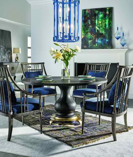
FFDM Candence: Notice the blue on the upholstery, lighting fixture and accessories – they leap from the backdrop.
Blue is one of the colors that are frequently referred to as people’s favorite. It is the representation of the beautiful skies and the pristine waters of many beaches. It may be rarely seen in fruits and vegetables but this is no less than the perceived color of heaven and serenity, hence, it is no surprise that a lot of corporations use this hue on their logos.
Blue is a cool, slow, even wet compared to the vibrant intensity of red. Blue also has contradictory meanings more than any other hue. Here are examples –
Most tints and shades of blue represent loyalty, trust, understanding and tidiness. What’s ironic, though, is that blue is also the color of depression in our country. Expressions such as feeling blue or singing the blues are examples of such notion.
Blue Trivia
There are many interesting facts about the color blue. First, it is the world’s number 1 favorite color. Also, about 53-percent of flags all over the world have blue in it. This is also the most used color in corporate logs, blue blood means you are an aristocrat, blue is the fundamental color for baby boys and, lastly, dark blue suits are the standard in professional business attire.
Blue also has few connections with the sense of smell or taste which is why it is an effective appetite suppressant.
Blue is almost in everything which is why you will never go wrong when you decide to use this as your color motif.
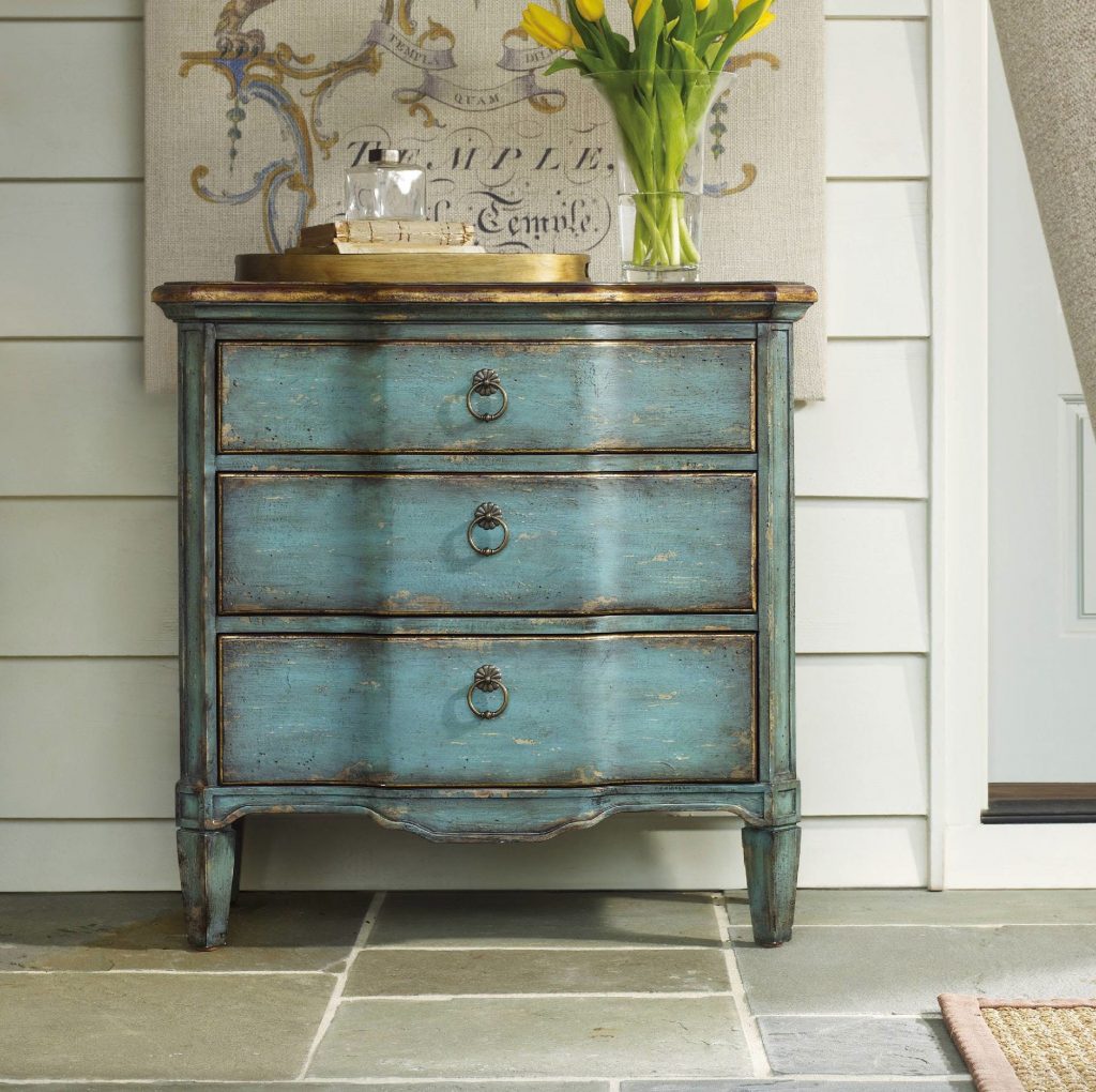
Hooker Furniture Living Room Three Drawer Turquoise Chest
Blue in Interior Design
Now that you know how important blue is, it’s time to consider how you’re going to use it in your home –
The Infamous Blue Door
Apart from red, blue is also an interesting color to use on your front door. Blue is perfect for a home with brick exterior. This door will surely stand out even with the delicious vision that bricks offer.
An exterior with mixed colors could do well with a darker blue door (almost to the point of being gray). The blue will act as a neutral hue that will ground the entryway.
Tags: blue color scheme, blue design, blue interiors, McCreerys, McCreerys Home Furnishings
Posted in Color Schemes, Interior Design 101, Interior Design Elements | No Comments »
Friday, August 5th, 2016
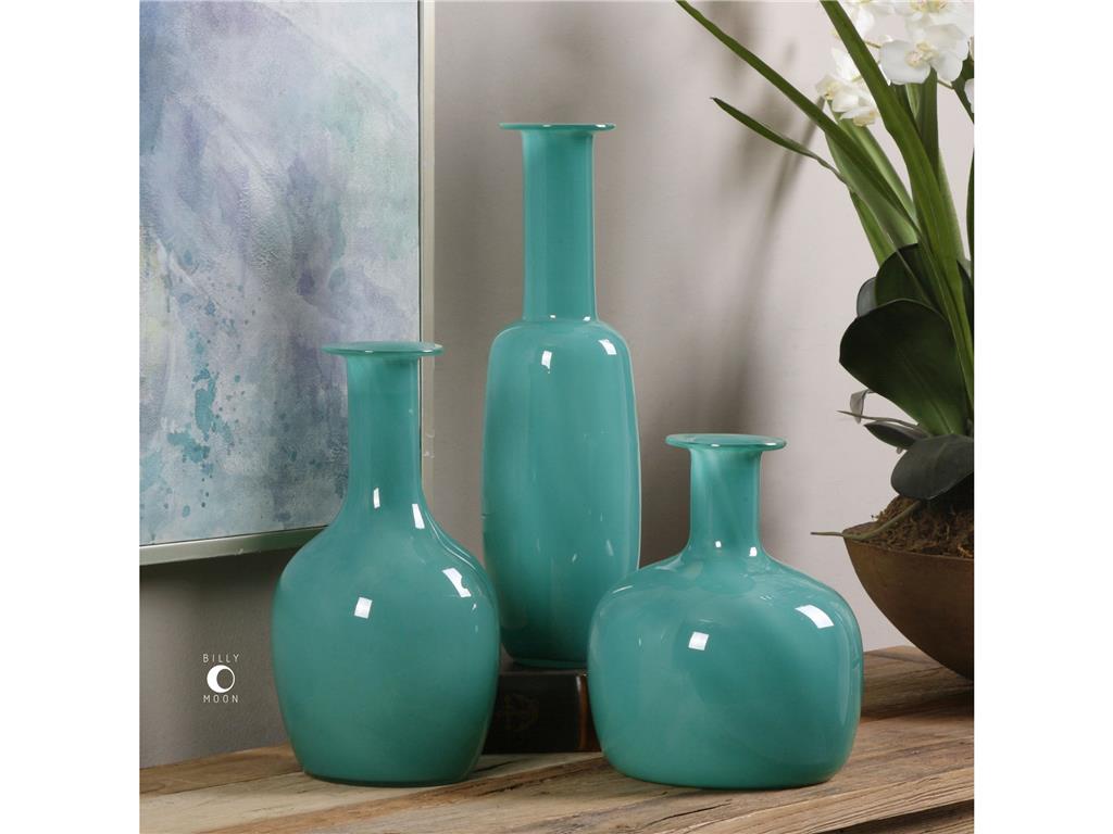
Accessories Uttermost Baram Turquoise Vases, S3 20017
Turquoise is a color named after the gemstone. It brings to mind soothing beach waters and the most relaxing bay breeze. This color is considered soothing and is used in a few mental health facilities because it helps create a serene atmosphere.
There are, however, a few colors that are called turquoise but are not actually turquoise. This is not teal, neither is it light blue, it is not aqua, too. Turquoise, simply put, is a mixture of green and light blue. Tints of this color come with infused yellows in different shades. This color can be anywhere from cool to warm, pale to vibrant.
Pairing Turquoise
Turquoise is a best friend to many colors. It effectively complements citrus tones such as lime. It can also work with its cousin color, blue, as well as in different shades including navy blue. Put the navy blue, turquoise and red altogether and will have achieved a Mexican, Caribbean vibe. Add some Native American motifs and art, consider also if you can set up a Mid-Century modern design.
Go ahead and pair turquoise with warm or bright white and that’s an instant beach look for you. Use mustard or amber and what you would evoke is an Old Mexican vibe. Put turquoise with gold and what you would have achieved is instant glamour.
Fall In Love with Turquoise
You can fall in love with turquoise if you are the type that loves sticking his toe in the water. A jaw-dropping turquoise chandelier is a grand way to use this color in your living room or dining room design. You can use olive-colored walls as an equally breathtaking backdrop for this interesting lighting fixture.
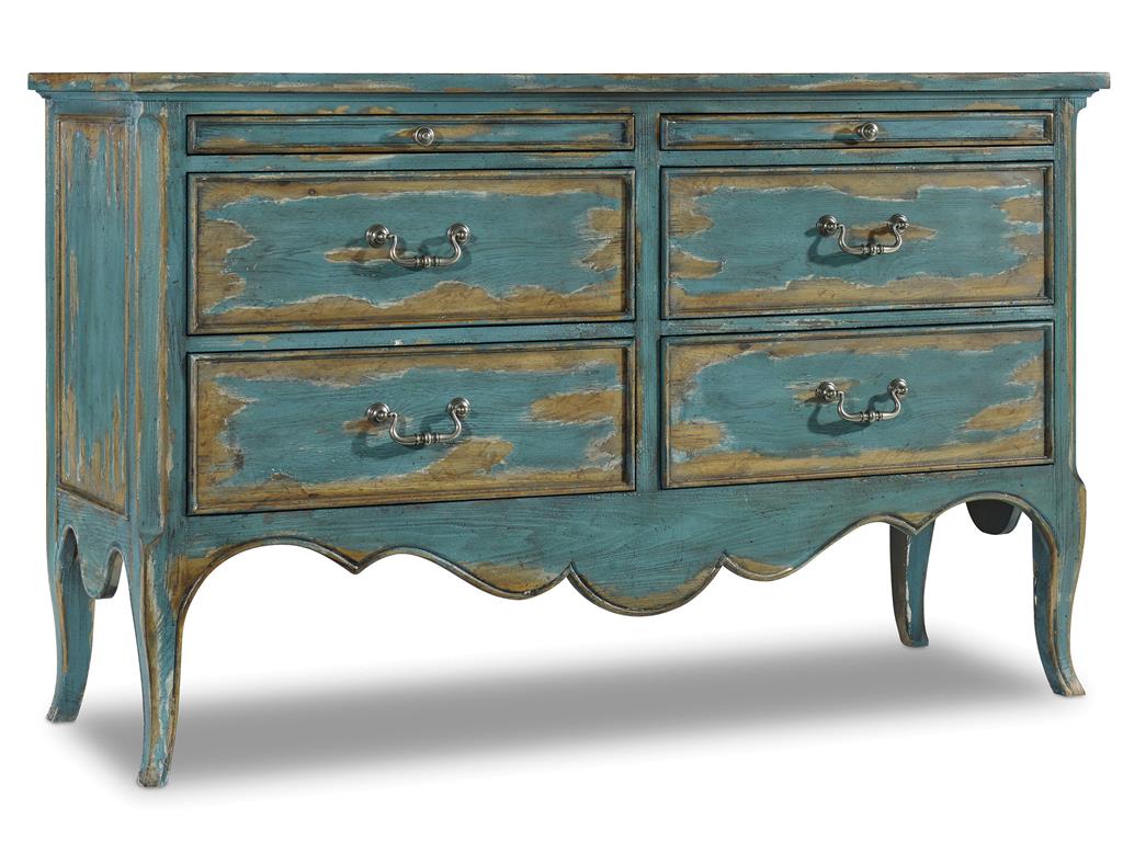
You can also paint that old chest that you’ve been keeping in a distressed color. You can then add accent pillows in, guess what – turquoise! This is both an energizing and soothing way to try turquoise in your home.
That Turquoise Wall
Just like other vibrant colors, turquoise can also be painted on an accent wall. This can add energy as well as light to any neutral-colored room. This is especially wonderful inside the dining room or a kitchen.
Turquoise accent wall paired with natural wood as well as warm whites simply spell happiness. If neutrals don’t fascinate you, then add a little dimension to the room by having turquoise painted right next to dark coral walls.
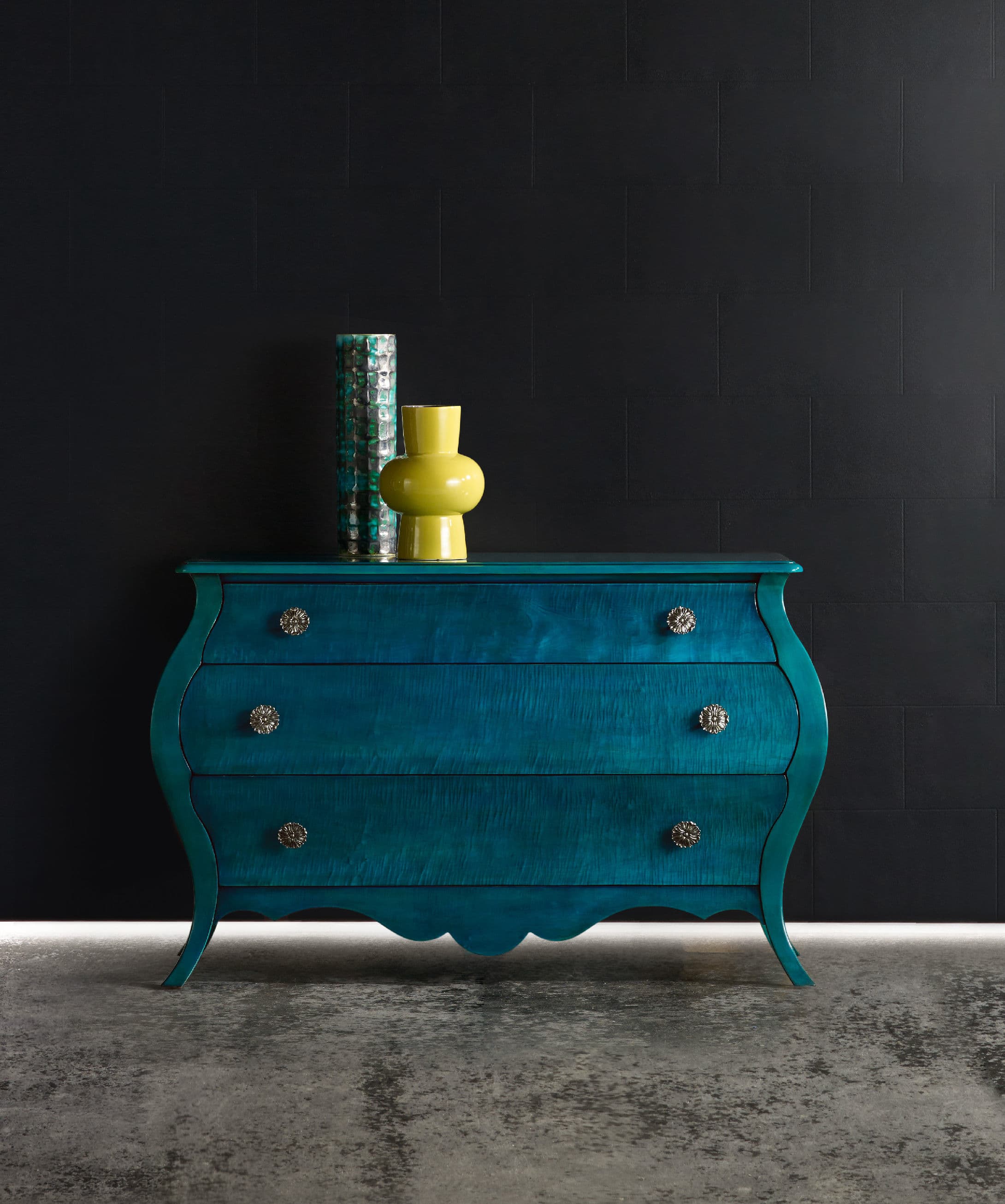
BLOG 7. Hooker Furniture Living Room Melange Nina Bombe Chest – Turquoise
A Turquoise Bathroom
Turquoise can enliven and calm at the same time especially when you use it inside the bathroom. Gold and turquoise will also work wonderfully inside this space more so when you decide to use it on your wallpaper.
Use turquoise and white in this room and you would create a glamorous beach-like bathroom. That style is very Miami.
Personalizing with Turquoise
Popping turquoise in a traditional setting is a unique way to personalize a room. A desk made of natural wood, for instance, could just be another nondescript piece inside a hotel room. A touch of turquoise could make a huge difference.
Lastly, are you interested in creating pale turquoise on your own? Here’s a simple method to do just that –
Tags: blue, blue color scheme, blue design, blue design blue interiors, McCreerys, McCreerys Home Furnishings, turquoise, turquoise color scheme, turquoise interior design, turquoise interiors
Posted in Accents, Color Schemes, Interior Design 101, Interior Design Elements, Interior Design Themes | No Comments »
Monday, July 25th, 2016
Hooker Furniture Living Room Sanctuary Four-Drawer Chest
Sky blue is a color that hints of the seaside; lets you picture springtime; and the bright blue skies. There are many reasons to love this calm color. You can use this in both interior and exterior parts of your home namely the ceilings, kitchens, bedrooms, even that cute picket fence.
All About Blue
Blue is the color of honesty, trust, even loyalty. It is often quiet, sincere and reserved. This isn’t your go-to color if you don’t want to draw attention as it detests confrontation.
Speaking of color psychology, blue is also believed to be a reliable as well as a responsible hue. Sky blue is confident and secure, it is a great color to give direction and order in any work or living space.
Blue seeks out tranquility and peace above any other characteristic. It is a color that promotes mental and physical relaxation, thus, it can reduce stress.
Don’t you just feel a sense of calm if you see a sea of cloud-like blue? It is because it can slow down one’s metabolism. The paler the blue color is the more independent you would feel.
In giving meaning to blue, it can also relate to one-on-one communication. This is especially true when you speak the truth verbally. Blue, in essence, is the public speaker, also the teacher.
Blue is an idealistic color. It enhances self-expression and one’s ability to communicate his wants or needs. This is a color that inspires high ideals.
If you are conservative when it comes to interior design, then blue is the right color for you. It is predictable, non-threatening, and safe. Blue can be determined in pursuing any endeavor that it is after.
Blue is difficult to alter because it is inflexible when faced with a different or new idea. It may analyze, consider, and mull things over but it has its own version of reality.
Blue can also be nostalgic as it tends to live in the past. If all these descriptions reflect your personality then you can go ahead and pick blue as your color scheme.
There are many other reasons why blue would work for you –
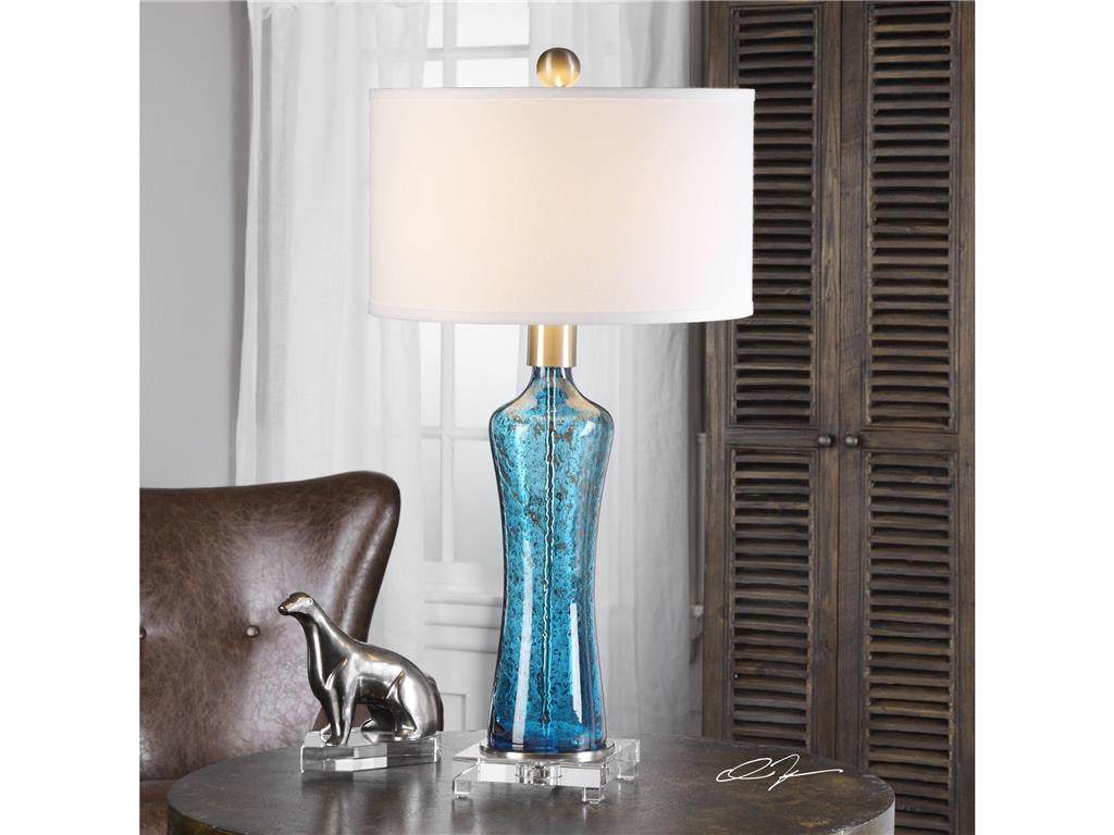
The sky blue of this Uttermost Lamps and Lighting Sekani 27207 blends beautifully with the chocolate brown background.
Blue Is Classic
Sky blue can be worn all year long. It can look great in spring, look fresh when paired with citron and pale green. During summer, sky blue’s vibrant partners are turquoise and white; and in the cooler months, you can warm up this color by adding rich orange, gold and chocolate.
Sky Blue Is A Crowd Favorite
Are you searching for a color that is usable in your home? Sky blue is fun and bright for those who like things to be flamboyant. It is also a subdued color for people who love the classics. This is a hue that is non-gender specific.
Sky Blue Is Enduring
If you are picking the colors for tile work, cabinetry, or a new sofa, then sky blue is a great hue to resort to. It will not look old or tired even after you use it for a season or two.
One other reason why sky blue is enduring is because it can cool down any warm hue. You can pair it with bright colors such as cherry red if you want to achieve a summery look. This color can also remind people of their childhood memories where they go to the beach or look at the clear, blue skies. Remember that nothing can be more beach-like than sky blue.
For a more polished look, sky blue can be paired with sandy or creamy hues. This is the traditional choice for a subdued living room scheme.
Tags: blue, blue color psychology, blue color scheme, blue design, blue interiors, McCreerys, McCreerys Home Furnishings, sky blue color scheme, sky blue design, sky blue interior design, sky blue interiors, tips
Posted in Color Schemes, Interior Design 101, Interior Design Elements | No Comments »
Follow us on our social media
© McCreery's Home Furnishings | All Rights Reserved | Privacy Policy