- Follow us:


Monday, May 22nd, 2017
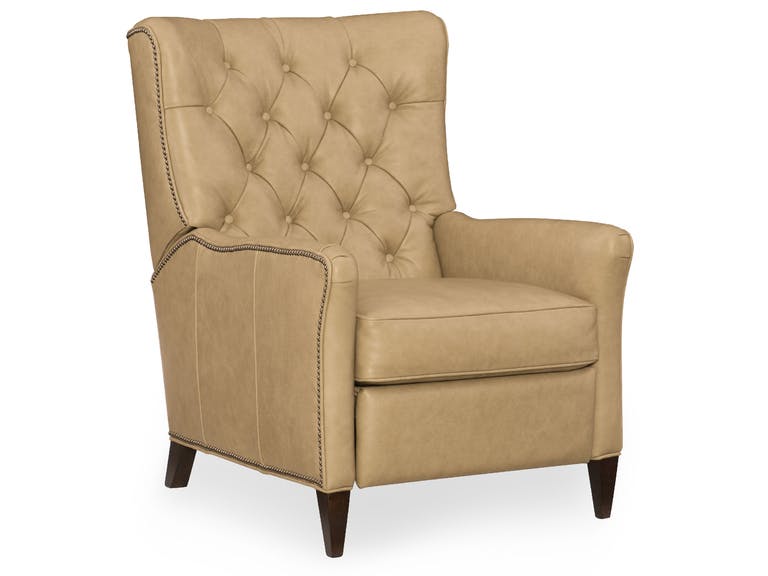
Hooker Furniture Living Room Irina Recliner
You may think of beige as an overused hue but with the right mindset and a fresh set of eyes, you will see that it is just an undervalued color that is reliable. Beige is a color that may not scream party but it can be far from boring if you learn to use it in a non-default mode.
Beige is subtle, this one is certain. The shade of beige that you use will make or break the look of a room. The eventual look depends hugely on the kind of light that you use with this color and the architecture upon which it is utilized.
Other Names for Beige
Beige is also known as cream, buff, tan or khaki. It varies greatly from cream to almost brown. This color can have subtle to warm pink or yellow undertones. It can also be almost gray. Pink and beige also look great when combined no matter what undertone is used.
Ivory is considered a similar color as it is also calming, neutral and relaxing. This is close to the color white though it offers a warmer tone. Ivory spells pleasantness and a quiet solitude. It also spells elegance.
Meaning of Beige
Beige is flexible and conservative at the same time. It is neutral, relaxing and calm.
Beige can also offer the comfort that brown offers as well as the coolness of white. This is a relaxing hue insomuch that its wrong use could mean a boring or dull room.
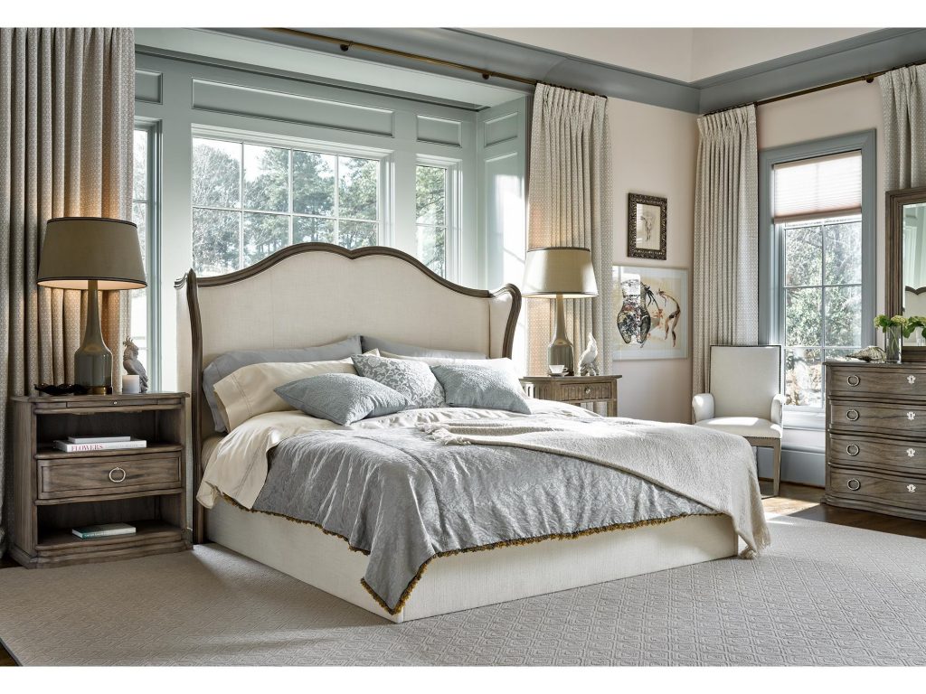
Beige is shown here on many layers; featuring the Meritage Lazarus Queen Headboard.
Beige on Interior Design
You can begin your journey towards a beige-colored habitat by having this color on your walls. A cool, light beige can add warmth in a huge room. It can also look traditional or modern depending on what style you’re leaning towards.
Light beige is a wonderful alternative to stark white walls especially in modern spaces.
To make beige more interesting, you can fuse it with bright red. A white trim should keep this fusion clean and crisp.
When you choose to layer beige, say, from a light cream all the way to tan, then you create a calm and airy room that’s perfect for a living room setting.
Having beautiful architectural stairwells could also be the perfect spot to use beige. Have the walls painted with beige while the stairwell is shown with a white trim.
Use warmer beige with a light yet warm-toned blue. This is the classic sea and sand combination. Beige is also an awesome backdrop for any eclectic setting. It is the warmer version of white though it will never compete with other furnishings and accessories.
If you happen to love the grayish shade of beige, then you can use it on the hallway. It will surely provide an elegant and traditional look that is never jarring yet it also begs for the good kind of attention nonetheless.
Never look at beige as a mere base color. It can also be effectively used as an accent hue. Beige walls can highlight the beautiful angles in a room and it can even offer depth where other colors fail tremendously.
Again, beige doesn’t always have to be the default wall color. This can also be used as the trim. Dark beige door is the perfect focal point in a room that’s filled with white walls and beige furnishings.
Speak of furnishings, more specifically feminine furnishings, you can always rely on beige as an anchor color. Use it with gold and what you have achieved is a room to behold.
Use beige in any room that you want. The trick is to look beyond it being a backdrop hue and to use it as a highlighting color or the focal point of the room if you may.
Tags: beige, designing with beige, McCreerys, McCreerys Home Furnishings, stylizing with beige
Posted in Color Schemes, Interior Design 101 | Comments Off on Working with Beige: The Hottest Ways to Make This Hue Look Awesome in Your Home
Thursday, January 12th, 2017
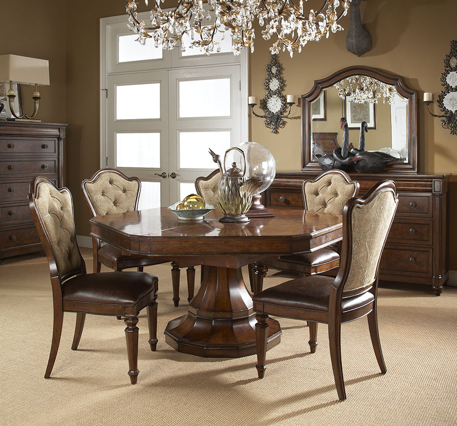
Luscious beige pieces are displayed in this FFDM Highlands ensemble.
Beige is a multi-faceted color. It is flexible, conservative, reliable, relaxing and neutral. It represents many other things with the meanings taking place based on colors that beige is fused with.
When used incorrectly, beige could turn out to be dull and boring which is why you have to know how to work around this wonderfully flexible color.
Beige is often undervalued and even overused. This is a color that rarely gets all the attention as it frames other design elements.
Beige need not be boring. It only becomes such as a lot of homeowners default to this hue without fully understanding its potential. You need to value its this hue according to its tone and worth. Give it thought before jumping to use it in your habitat.
Beige is subtle yet it can also be exciting depending on the play of light and architecture upon which it is used. Yellow beiges look wonderful when paired with turquoise, teal, yellows and blues. Vivid red looks more, well, vivid and elegant when it sits right next to warm beige. Pink and beige will always be lovely no matter what undertone you use.
Beige Layers
You could also layer beige to create a more calming look. If you are able to achieve this, then it would feel like you’re walking into a room made deliciously with cashmere. Every single beige tone (light to dark) work well with white trim. Traditionalists would never fail with this combo.
Beige is also literally in every traditional space. Wide open spaces that are in boho, eclectic or modern homes also use splashes of this color.
Beige on Walls
Nice, cool beige inside a huge room will add warmth while remaining modern. The lighter shades of beige are a great alternative to stark white in many modern spaces.
If you’re thinking of the best backdrop in an eclectic home, then use beige walls. It is warmer than the usual white and it will never compete with other colors, even the furnishings.
Just Like Beige
If beige is a little too warm for you, then you can also use ivory which is its calmer and a more neutral version. Ivory is the perfect color for that understated elegance. It is also the traditional 14th wedding anniversary present while the deeper and more classic color of pearl is the traditional 20th wedding anniversary present.
Opal or pearl, both interesting shades of ivory, are also considered precious gems. The tusks of elephants are highly valued across many cultures. They are also widely used in creating décor, jewelry and furnishings.
Other Tints and Shades
Here are additional terms that represent varying shades, values and tints of beige: biscuit, tan, buff, oatmeal, camel, ecru, cream, and mushroom. Other terms include pearl, off-white, milk white or opaline.
Winning Beige Combinations
Beige is the best hue partner for every color that you can think of. But there are certain colors that become magical as they fuse with this base color, making your living areas come to life.
Beige and blue is the perfect balance. Find light beige furniture pieces and have them framed by the blue walls. Accents like pillows and rugs could also be in blue.
Experimenting with blue means you are ready to be dynamic. It is also a sophisticated and classy combination that would certainly impress each guest.
Beige with turquoise, cream or lilac is the ultimate shabby chic solution. This is a fusion that evokes romantic and gentle feelings. The warmest that you can go with this combo is to use purple, olive or chocolate tones.
Beige is also modern if you make it the accent color of details in your home. Beige may appear simple to the naked eye but it has wonderful benefits to give to those who are willing to explore it.
Tags: beige, beige paint, designing with beige, McCreerys, McCreerys Home Furnishings
Posted in 2017 Trends, Color Schemes, Interior Design 101, Interior Design Elements | Comments Off on Beige: The Color of Adaptability
Follow us on our social media
© McCreery's Home Furnishings | All Rights Reserved | Privacy Policy