- Follow us:


Wednesday, November 22nd, 2017
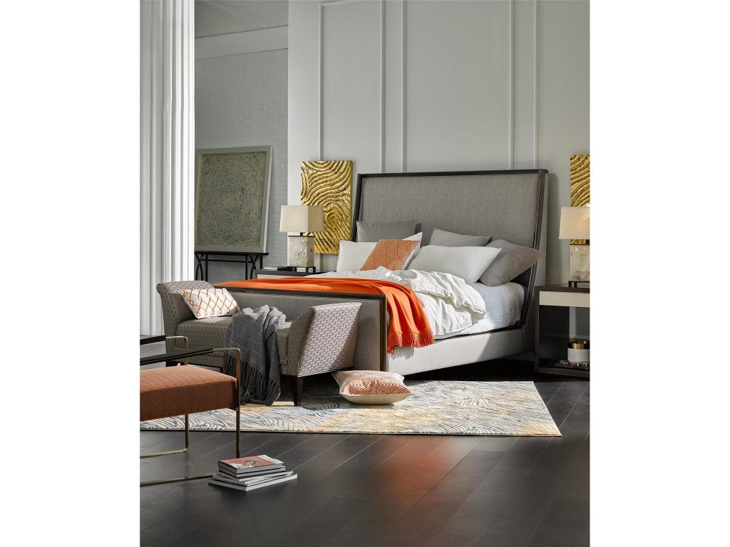
L’Arc King Upholstered King Bed from the Deco Collection of Fine Furniture Design was aptly framed by the pops of orange all around.
How do you feel around the color orange? This hue is an energetic and strong color because, to begin with, it is the fusion of two powerful colors – red and yellow. No wonder, orange is attention-grabbing which is why it is often used in ads.
People look at orange and they feel suddenly happy, bright, and uplifted. Too much of it and it can be overwhelming, too. Just like purple, this bright and standout color is a controversial one. You either love or hate it – there are no gray areas or feelings for it.
So how do you use orange so that you won’t appear vulgar or blatant?
It is crucial that you understand how the feelings associated with orange are not universal, meaning, culture and other factors also play a role in how you perceive this color.
The way you perceive orange also plays a role in how you are going to successfully use it in your home. If orange is linked to autumn then, in your mind, you will feel positive feelings about it. It could be inadvertently linked to activities done during the holidays.
Orange can both be energetic yet spiritual. If there is one universal thing about orange, it is that it almost always become the center of attention. This is a color that is definitely begging to be looked upon.
Orange Interiors
Just imagine carrot-colored area rugs or apricot bathroom tiles – all these achieve a reputation of being retro-chic. Are you going to be in when you decide to use orange at the end of this year?
Oh, absolutely. Just try not to think of this exciting color as something that you should avoid. Use it, instead, to your advantage.
Orange + White
Just like lime green and banana yellow, if you do paint your walls with a vibrant color such as orange, of course, every activity there will be equally vibrant. Don’t let this color make you overexcited, though, as it can be toned down to compliment other color schemes.
The most basic way of doing this is to opt for the simple combo – orange and white. Time to break up those orange carpets with white details then keep repeating the look with white cornices and whitewashed woodwork.
If you like the idea of having an orange accent wall, then be sure to keep the other three plain. Break up this look by placing whitewashed cabinet right in front of that exciting accent wall.
Not too many people decide to use orange in their bedrooms but should you do so, be sure to use white linen and mix with orange and white pillow covers. White and orange drapes also work well in a more relaxed environment.
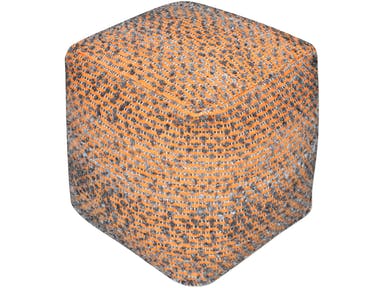
Be retro-chic with the Uttermost Accessories Valda Orange Wool Pouf 23953.
Orange Living Room
An awesome way to use orange is for it to add the necessary warmth in an otherwise cold ambiance. Just imagine a reception room with an orange accent wall – it’s like screaming welcome, we love having you here!
Predominantly white living rooms badly need a breath of energetic orange. Mid-orange tint should do the trick and should be amazing enough to create a little excitement in any boring space. Add natural light and you can even get away with two orange accent walls.
Twin Tone It
‘Tired of using orange as mere accent color? Then you’re one of the bolder few. Go ahead and use it alongside other vibrant hues such as yellow and red. Mid-orange walls work well with sienna ceilings just as yellow ceilings also work with a single orange wall.
Orange Details
Now, down to the details. Your guest bedroom, for instance, can be the home for orange, brown, and gray hues. Orange will dominate, of course, especially when you use it at the center of the activity such as when it is an area rug or a lampshade.
Detailing works for chairs, too.
Tags: McCreerys, McCreerys Home Furnishings, orange, orange as a design element, orange color psychology, orange in interior design, orange interior design, orange interiors
Posted in 2017 Trends, Accents, Color Schemes, Interior Design 101, Interior Design Elements, Interior Design Themes | Comments Off on Orange Picks for Your Home
Monday, October 3rd, 2016
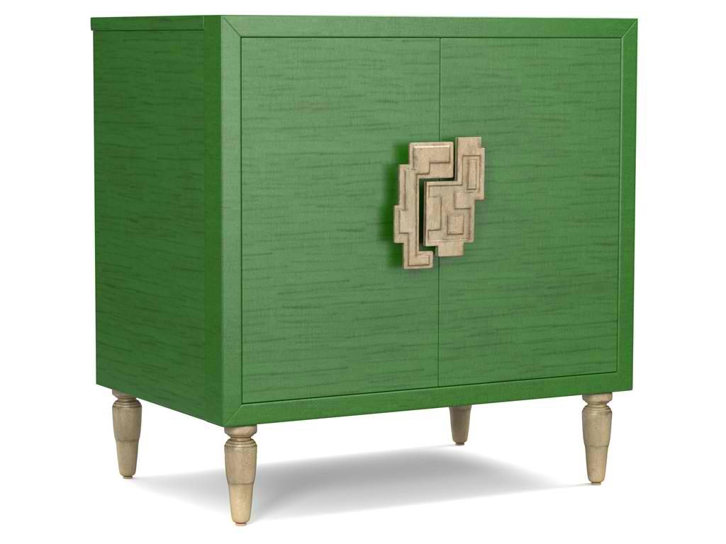
The green hue on this Cynthia Rowley for Hooker Furniture Living Room Sheridan Two-Door Chest 1586-50005-GRN is wonderfully prepped for 2017.
There is no doubt that color is an important element of interior design. It is one of the most influential aspects to human emotions. This is also the fastest way to update a room; what you need to do is just to apply a fresh coat of paint and you’re done. But what do different hues convey and what color forecast best fits the brave new year that is 2017?
Top Hues and Their Meanings
Red. This hue is often associated with determination, leadership and ambition. This can also connote physical desires which is why it is most used in many restaurants.
Pink. This hue represents intimacy, compassion and unconditional love.
Purple. This is the color of creativity and royalty.
Blue. This color represents loyalty, honesty as well as trust.
Orange. This bright hue is linked to optimism and motivation.
Green. This lively color represents vigor and energy. It is often used to create balance and stability.
Yellow. This is a hue that represents enthusiasm, fun, knowledge and hope.
Color Fundamentals
Color is affected by two aspects – the surroundings and the kind of light that shines on it. Try observing any room in your home. You’d soon see that the light is different during different times of the day. Comprehending how light can affect a space during different times of the day will give you the power to choose the correct color scheme that can be used all day through.
This same knowledge will also help you choose the best kind of lighting fixture for that room.
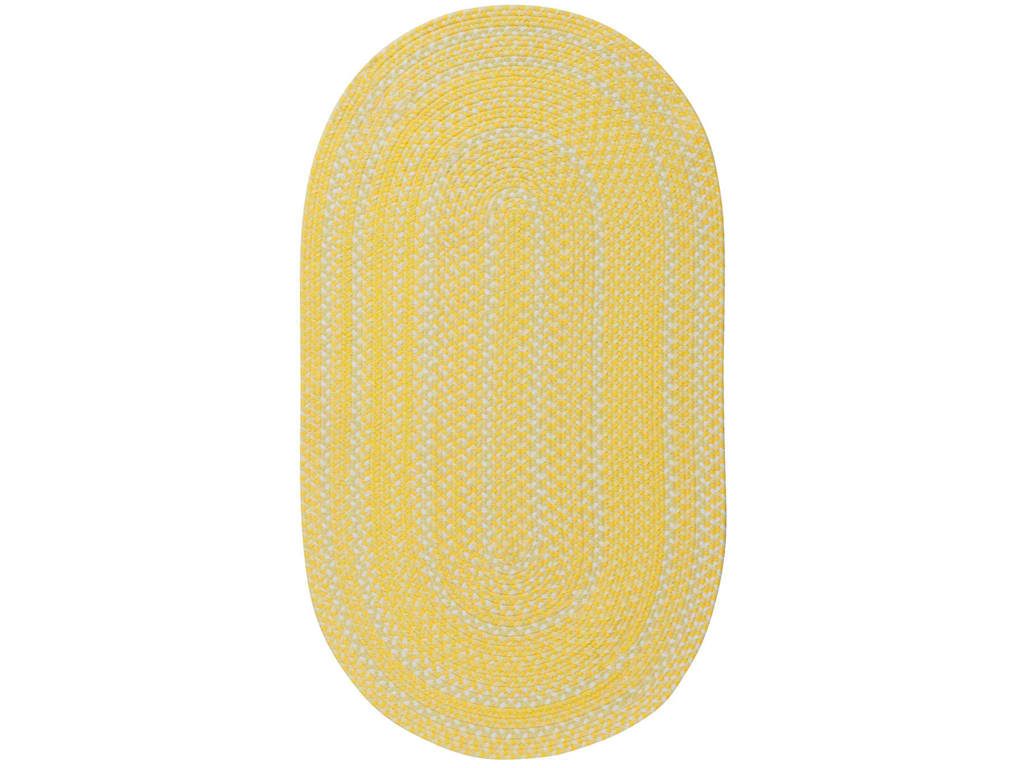
Capel Incorporated Floor Coverings Regatta Rug 0087NS Sunshine
Now, the Forecast
There are many color forecasts that are being done each year but one of the most esteemed are the picks made by Pantone. The upcoming year’s Color of the Year picks are calming, soft and wonderfully romantic. Now don’t worry if those aren’t your exact wish as a color for your home.
Leatrice [Lee] Eseman shared a handful of color palettes that you could choose from. These are all predictably popular colors for the upcoming year that you can use to beautify your home. These colors were also chosen because they address the consumers’ craving for colors that are comfortable yet new. Design trends became inspirations for many of these palettes, so was the film industry (e.g. The Peanuts Movie, Star Wars: The Force Awakens, etc.).
So go ahead and make use of anything silver and metallic or anything bright and colorful (if Charlie Brown inspires you the most). Say yes to orange chiffon, melon as well as dove gray. Grape and lime are also good colors.
Apart from these, there will also be an abundance of florals this upcoming year. Floral hues such as red Dahlia or pink yarrow, plus any shade of green may be acquired tastes but they are beautiful and not-oft used colors.
Gray and red will remain popular in 2017. They will both appear in warmer hues with the backdrop being that of bolder colors. Yellows that look perfect in a harvest setting will also get a lot of attention in the coming year. Yellow with hints of earthiness will look great and would be effectively grounded by classic red or blue.
Any youthful color is also a great choice in 2017. Now don’t be limited to the age-appropriate colors, rather, look for youthful colors with an attitude. So no matter what your age, you can use color palettes that are fluid and can easily morph in the 2017 surroundings.
Find celebratory hues that hail technology and nature. The former will continue to play a vital role in people’s lives. Evolving technology will continue to inspire ambience that is dark or in commanding grays.
Those who love deep plum would also find it a great news that the color forecast for 2017 also includes this hue.
Tags: 2017 color trends, adding colors to a home, blue, bold colors, bold hues, color choices, green, McCreerys, McCreerys Home Furnishings, orange, pink, purple, yellow
Posted in 2017 Trends, Color Schemes, Interior Design 101, Interior Design Elements, Interior Design Themes | No Comments »
Follow us on our social media
© McCreery's Home Furnishings | All Rights Reserved | Privacy Policy