- Follow us:


Thursday, July 6th, 2017
(The Last of a Six-Part Series)
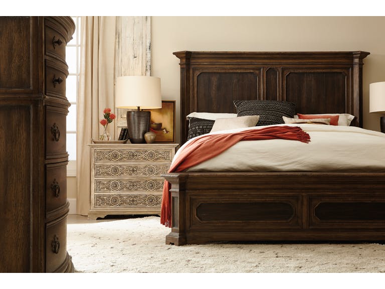
The perfectly painted walls served as the beautiful backdrop for this Hooker Furniture Bedroom Woodcreek King Mansion Bed.
Painting your home’s walls is the most basic way to freshen up your entire place. This can be a tricky task, though, as it can just as easily turn into a nightmare. Here are some tips on how you can keep your sanity as you try to update the look of your home –
Practice and Be Patient
Interior house painting is a very popular DIY (do-it-yourself) activity. With this said, you can have this become a home activity or a project with your friends or office buddies. There isn’t a more affordable way to freshen up a home than to put on a new coat of paint together with your friends.
Painting is not difficult, in fact, you don’t need to have specialized training just to be able to do it. Any person who is able-bodied should be able to paint a room but you must have a bit of practice prior to the real project. Also, you need a lot of patience in order to finish the task.
Surface Prep
Successful paint jobs are successful because they began correctly. You need to properly prepare the surfaces that you are going to paint. This means you will have to sand, scrape, patch and then fill each hole that you could find.
Search also for dents, cracks and surface imperfections. This is not the fun part of your painting activity, in fact, it can be the most tedious part though it is a crucial part that you cannot ignore.
No amount of paint, no matter how pricey, will hide a cracked or pockmarked surface. Don’t think also that a thick coat will be able to hide imperfections – it won’t. It will only highlight the unprepared surfaces.
Primer Tinting
Priming the walls and ceilings is also mandatory when you need to paint over a wall with a darker color or a new drywall.
‘Wanna know why it is smart to first prime before you paint any wall surface?
Primer paint serves as a blocking stain from bleed through. It also allows a single-coat coverage for your main paint and, most importantly, it lets the paint adhere more, thus, peeling and blisters are greatly reduced.
A professional painter will tint right to the finished color. He does this by mixing topcoat paint to the primer. This will enhance the hiding capability of the top coat on the primed surface.
There are also paint nowadays that have primers. Nothing can cover as well as a dedicated primer, though.
Choose Canvas Over Plastic
Drop cloths are always plastic – you may have heard this a lot from your friends and relatives who finished their painting projects. While canvas is more expensive, it is better to have it because it is rip-resistant and highly durable.
Canvas also absorbs paint drips more than plastic cloths which can even contribute to accidents when the drips cause a slip.
Use an Extension Pole
Where needed, that is. Don’t risk using the stepladder, instead, invest in a telescoping extension pole. There are some that are even 18 feet long which can extend to 36 inches when fully extended.
Look for one that has that nonslip grip and metal core.
When You’re Done Painting
Once you’re done painting for the day, but would still need a few more surfaces the day after, be sure to roll off excess paint then wrap the brushes with food wrap. Double up so that you will seal off air completely.
This actually works in keeping the paint from drying off, thus, it would save you a lot of time from laborious cleaning of paint brushes.
The next day, remove the plastic wrap and you’re good to continue.
Tags: home painting, McCreerys, McCreerys Home Furnishings, painting, painting advice, painting guidelines, painting tips, wall painting
Posted in Color Schemes, Home Maintenance, Interior Design 101 | Comments Off on Color 101: Handy Paint Guidelines for Walls
Tuesday, November 1st, 2016
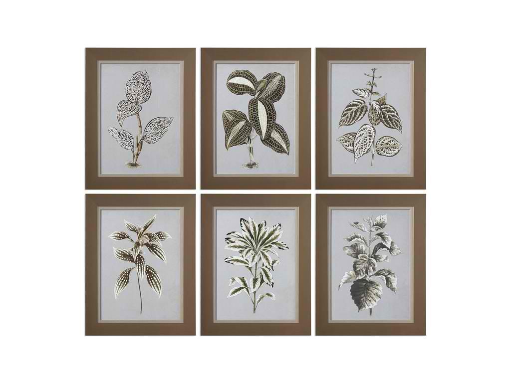
Your bathroom paint will become more interesting if you hang these Uttermost Accessories Variegated Plants 33642 on the walls.
One of the most inexpensive ways to spruce up a bathroom – or any room for that matter – is to play with colors through painting. A lot of homeowners, however, are inexperienced when it comes to bathroom design. They find the color palette to be so extensive that they get intimidated by the mere sight of it. The great news is, all you need to do is to be introduced briefly to the color wheel, add a little creativity and you would be on your way to designing your dream bathroom.
Don’t Get Overwhelmed
Getting intimidated is the worst thing that can happen to you when you’re out to design something. Bolder colors – keep in mind – are colors that are opposites on the color wheel (e.g. orange and purple).
Soothing colors, on the other hand, are the monochromes or single colors. You can remove the orange in the purple-orange duo and replace it with lavender so that what you achieve are relative hues.
Proper Color Placement
Now that you are more comfortable with the color wheel, you should determine how these colors will be placed in your home. Don’t think that towels, area rugs and curtains are the only sources of color for your bathroom. These days, you can add colorful fixtures from the calmer pastels to the more energized bold hues.
There are also elaborate brass and copper faucets. Don’t stick to the traditional, you can go ahead and experiment. The most popular themes, these days, are those that have Mexican or Indian influences. Say no to rubber ducky and yes to area rugs and colorful bathroom walls.
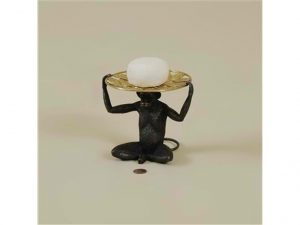
Maitland-Smith Bathroom Two Cast Brass Sitting Monkey Soap Dishes 1254-302
Pick Three Colors
As you become more and more comfortable in working with colors, you can now use the guiding principle in the creation of an awesome color scheme. Choose a neutral color, rich color and one accent color. Always think of the 70:20:10 ratios when distributing these colors respectively. This means that you use 70% of the lightest color, the second lightest should only be at 20% and the accent color should comprise but 10% of the entire color scheme.
Fuse Two Neutrals, Contrast Dual Brights
The ratio of proportion is also applicable in marrying two neutral colors. This time, use 70:30 where the lighter color still has the bigger percentage. Don’t forget to create a visual interest that includes interesting patterns. This could be as simple as a vein on the marble floor or a herringbone tile.
For a more energetic bathroom setup, consider using some brighter colors like blue and orange. These two are complementary colors on the color wheel. They are invigorating to the eyes and they provide the necessary excitement for your unique bathroom.
If you’re the traditional type who prefers a relaxing bathroom, then use the calmer colors such as whites, neutrals and pastels. Pick white as the main color for your tub, sink, trim and the central piece of furniture in this room.
Embrace Dark Colors
A lot of homeowners don’t just shy away from dark bathroom colors but they totally ignore them. Rich colors such as chocolate brown have the power to create a dramatic contrast especially in a space that’s filled with white fixtures and trims. Add another dose of a rich hue like green and what you’ve achieved is a more animated and contemporary look.
Don’t get nervous in putting darker colors especially in small rooms. You may have a small bathroom but you can easily offset the compacting power of dark colors by using mirrored lamps or a mercury glass. Doing so will make the bathroom less claustrophobic.
Go Green
Lastly, no modern home should say no to a greener space. Say yes to inspiring hues such as sea foam green or lemon yellow. Such colors could easily soften rough edges as well as solid, geometric shapes in your bathing space.
Tags: bathroom paint, home painting, McCreerys, McCreerys Home Furnishings, painting, painting advice, painting guidelines, painting job, painting the bathroom, painting tips
Posted in Bathroom Design, Interior Design 101, Interior Design Elements | No Comments »
Thursday, August 25th, 2016

Maitland-Smith Lamps and Lighting Antique Brass, Brass Wall Lamp 1943-130 is a unique replacement for the usual painted wall.
Interior painting is no less than the most popular home improvement project in the world of interior design. This is understandable as it is an easy and affordable way to freshen up the look in rooms. Painting can also be done by family members as a weekend project as it does not require specialized training. What you need is just a little patience, some practice and a few tips.
Prep the Surface
The most successful paint jobs begin with surface preparation. This means you should sand, scrape, patch, and filling cracks, dents and holes. Basically, any surface imperfection must be solved. This is the dirtiest part of the project but it is also the most crucial. Do something wrong during this phase and something worse could come up later.
Primer Tinting
The next important step is to prime the wall. Primer can block stains from bleeding out. It also makes single coat possible as it also improves the adhesion of the paint used. Peeling and blistering could also be the result of non-priming.
There are now paints that come with primers yet nothing covers as great as a dedicated primer.
Plastic drop cloths are a cheap way of protecting furnishings and the floor from spatters. It may be wiser to invest in canvas, though. Canvas is durable and is rip-resistant. It offers a flatter layer compared to plastic which means you won’t have to worry about tripping that much.
Canvas drop cloth can be folded around doorways and corners which is another advantage compared to plastic sheets. Also, most plastic drop cloths are not reusable.
Canvas can last a lifetime.
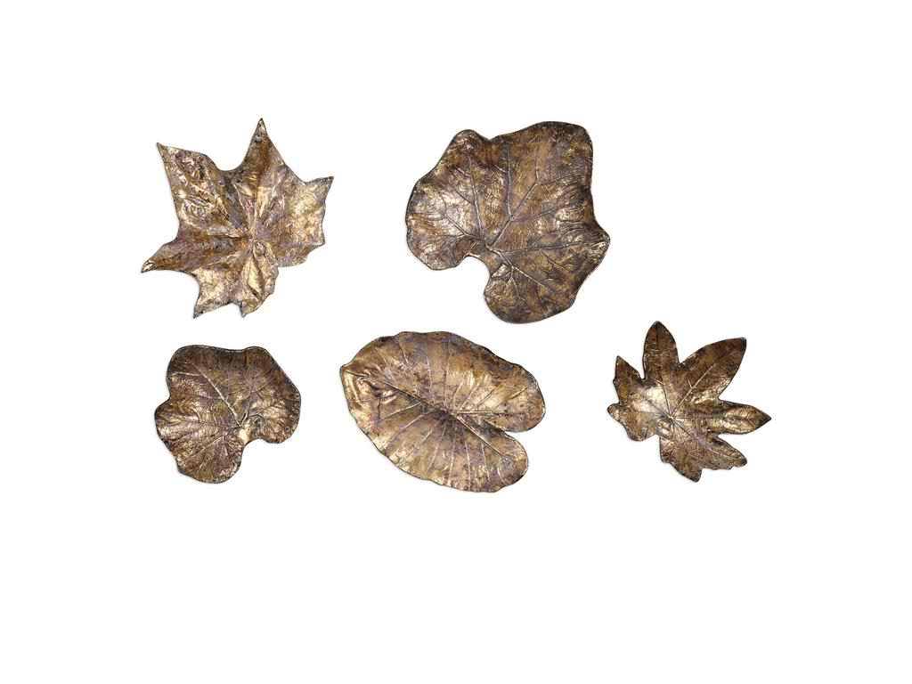
Uttermost Accessories Bronze Leaves Wall Art Set5 04063
Utilize the Paint Grid
Painting can take days so if you have more to do tomorrow, there is no need to go through brush cleaning each day. Simply roll off or brush the excess paint then wrap everything in food wrap. Double up the plastic to make sure that air is sealed out then have the roller sleeves and brushes placed inside the fridge. This should keep them fresh, avoiding paint dry up overnight. You can even store the brushes and roller sleeves for as long as a week if you are about to tackle an ambitious job.
The following day, just remove the gear from the refrigerator then use after 30 minutes.
Roll the Paint
A neater approach to rolling paint is to have it roll directly from the five-gallon bucket with the use of a paint grid. This is a rectangular plastic or metal screen that can be hooked on the rim of a bucket. Fill the bucket to about 50%, dip the roller, then roll it against the plastic or metal grid. This should remove any excess paint.
Use an Extension Pole
Get rid of the stepladder and use a telescoping extension pole instead. This comes in various lengths, with some extending as long as 18-36 feet. Longer extension poles are great in painting 8-9 foot tall ceilings.
As you shop for extension poles, make sure that you find one that has a non-slip, soft grip and a metal core. Check also that the threaded end of the extension pole is made of metal. Plastic handles may become too flexible which could make them a tad more difficult to control.
Just Paint
Lastly, what else is there left to do but to paint? Go out, find your favorite color and see if it blends well with your chosen theme. Ask your family members or friends to help out so that this project becomes easier. Shop for the tools together, plan the project together, and of course, don’t forget to have fun!
Tags: accent wall, home painting, how to paint, McCreerys, McCreerys Home Furnishings, painting, painting guidelines, painting job, painting task, painting the wall, painting tips, tips, wall color, wall painting
Posted in Accents, Accessories, Color Schemes, Interior Design 101, Interior Design Elements, Wall Design | No Comments »
Friday, January 29th, 2016
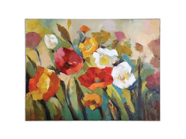
Accessories Uttermost Spring Has Sprung Floral Art 34268.
There is nothing more expressive when it comes to designing a home than the use of art. Art accessory comes in many forms but one of its most beautiful forms is a painting. Vibrant colors and rich textures can be infused with other design elements.
There are many media and styles featured in famous paintings, even repros. It is easy to find some pieces that can match your chosen theme and also your personality.
Watercolor paintings work best in achieving a softer look. This medium shows multiple layers of color ranging from abstract to life-like. For added contrast and detailed shading, find oil or acrylic paintings. These, on the other hand, feature mixed colors in various textures.
Painting History
The history of this art medium goes back a long way. Every style is born from the one that came ahead of it. Each artist also adds to the achievements of the early painters and is able to influence the next generation of painters.
Paintings can be enjoyed for their sheer beauty alone. But for the keen eye, their colors, forms, lines and composition appeal to every sense. Paintings can even leave lasting impressions.
The enjoyment of paintings is not the sole purpose of this kind of art. It can be used to convey a deeper message than mere beauty. It can express the artist’s impression of persons and scenes, even events. Feelings can also be described with the use of paintings. Viewers may or may not feel that emotions that are being conveyed by the artist. One needs a discerning eye for art in order to appreciate such things.
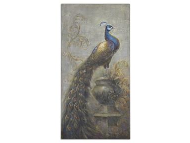
Accessories Uttermost Surveying The Kingdom Canvas Art 34283
Painting history can be encapsulated in these periods –
Man has gone a long way from the time when paintings were colored animal drawings inside caves. Cave dwellers were the first known painters, with their work found inside the caves of Spain and southern France.
Even back then, these cave artists knew that they needed vibrant colors to depict their lives back then. The famous painting of the wounded bison is still in the cave of Altamira in Spain today. While basic tools were used in the beginning, eventually, man learned to accumulate more materials and even learned techniques that improved his artwork.
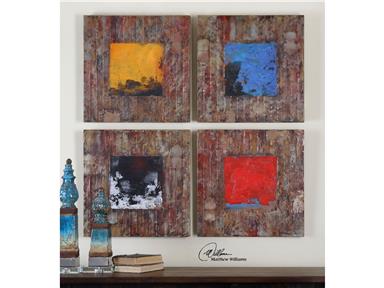
Accessories Uttermost Primary Blocks Wall Art S4 31303
You may not be able to take home an original Picasso, Monet or Michelangelo but there are still a lot of amazing paintings to go around. These days, the canvas can be the home for odd shapes, mere triangles, circles or rectangles in your sight but their bright colors and geometric patterns definitely mean something. It may even be difficult to distinguish between sculptures and paintings these days but the purity of hues and the shapes’ relationships are still there.
Artwork, as previously mentioned, comes in many forms. Clients are most familiar with the type that they can hang on walls inside their homes or offices. The next renowned pieces are tabletop artwork and sculptures.
Don’t get confused in choosing which medium you’d bring to your home or office. Just remember to show your personality through your chosen painting. Regardless of form, your taste and style should be reflected throughout the medium.
If you were a born optimist then it shouldn’t be a surprise to find brightly-colored paintings in your home. Black and white is for the stoic ones. What you have chosen based on your personality is a surefire validation that you have selected the right piece. Your art accessory is a representation of you so kudos!
Tags: 18th century, 19th century, 20th century, accent wall, art, art decor, artwork, choosing wall art, decorative painting, displaying artwork, history, McCreerys, McCreerys Home Furnishings, painting, paintings, Renaissance, rich hues, Rococo, shape, shapes, texture, textures, tips, wall decor
Posted in Accents, Decorative Elements, Interior Design Elements | No Comments »
Sunday, January 17th, 2016
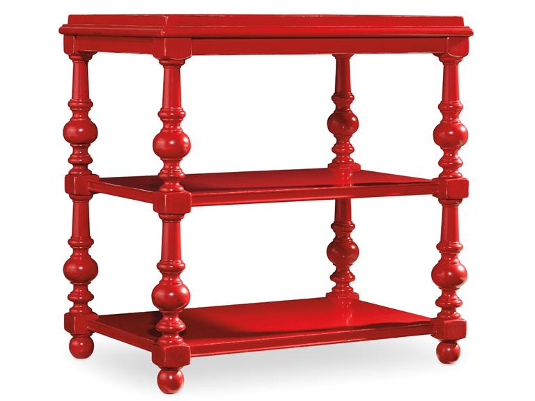
The Hooker Furniture Living Room Sanctuary Chairside Table will catch your guests’ attention if you let it stand against white or any neutral background.
You have probably seen those painting sequences on home TV shopping shows and thought that the people there looked like they were having fun. In reality, painting a home (or even just a portion of it) is far from being glamorous. You can actually exercise your organization skills and patience as you go about with this activity but, in the end, you will feel a level of satisfaction that will make you say – it’s all worth it.
The fundamentals of painting all begin with planning. As what’s always been said, always begin with the end in mind. Try to visualize your space down to the minutest details like what furniture would go with what color, what sort of accessories would blend with your chosen walls, would you use carpets or tiles, and many such details.
After planning and visualizing these things, it’s time to translate your vision into reality. You will surely be surprised to find out that your room or your entire home turned out to be quite like your visualized, ideal space.
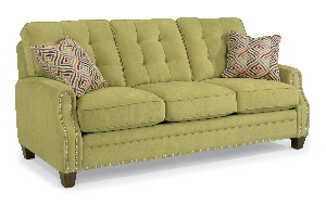
Sloan-Sofa-with-Nails-in-Fabric-917-22 is perfect for any colorful interior design theme.
Consider the Available Space
Many interior designers would agree that one of the first considerations that you have to make before you would start an interior design project is space and how much of it you can work with. The space that you’ll be able to work with validates the colors (paint) that you end up using.
Keep in mind that smaller spaces need light colors such as sand, white and cream. These light hues will give the small space an illusion of being more expansive. On the other hand, bigger spaces are like canvases for the homeowner’s imagination. You can use different hues depending on what needs to be expressed. Colors such as dark brown, navy blue, and black can lend a romantic look and feel.
Consider the Ceilings, Floors and Walls
As soon as you know how much space you can get your hands on, you also need to consider other parts of your home such as your floors, walls and ceiling. These are also parts of your huge masterpiece so they also need to be given some serious planning.
Just think of yourself as the liberal artist. Make a shortlist of all the colors that you think would make these parts of your home come to life. Do not go too crazy on the hues so that your residence remains tasteful. As much as you can, limit your color choices to just five hues.
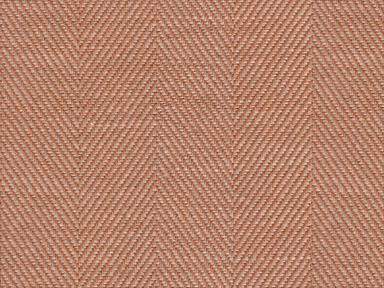
Just as you would the paint, it pays to ask for swatches when looking for the right fabric for your sofas. This orange/rust fabric comes from the Lexington cover collection available at McCreery’s Home Furnishings.
Get Color Samples
It is best to get paint swatches or samples from different paint centers. As soon as you have mixed the shades, wipe the paint swatch on a sheet of paper.
Test your chosen colors by taping the paint test swatches to the wall. See how the colors work for you visually.
At the moment, the top five designer colors are –
Light gray or ash can work as a substitute for the usual shades of white. It can effectively tone down the mood in any space while not neglecting on modernity and being sleek. Charcoal gray, meanwhile, can draw attention easily which is why it can be an effective paint on your focal wall.
White is timeless and it can efficiently frame any interior. Just make sure that you choose white carefully because it can become glaring.
Orange is a warm color that works best with metallic hues such as gold and copper. It is also the perfect color for autumn-inspired interiors.
Green reminds us of nature, freshness and going organic. This hue can make any space feel more fresh and relaxing. It can also blend well with other neutral colors.
Lastly, neutral paints can suit any style. They are easy to maintain and can become the primary color to an exciting accent color which you would later add.
Tags: accent color, adding colors to a home, colors, designer colors, designer paint, floor color, guidelines, home paint, McCreerys, McCreerys Home Furnishings, neutral paint, neutrals, paint, paint colors, painting, tips, wall color, wall paint
Posted in Color Schemes, Interior Design 101, Interior Design Elements, Interior Design Themes | No Comments »
Follow us on our social media
© McCreery's Home Furnishings | All Rights Reserved | Privacy Policy