- Follow us:


Thursday, December 7th, 2017
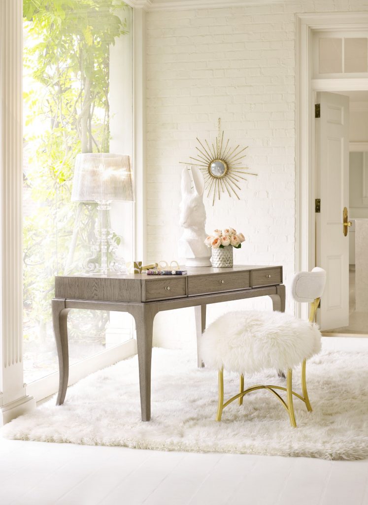
Or it’s just lovely to swim in white with specks of gold and pastel. Featured here is the Cynthia Rowley for Hooker Furniture Dining Room Swanson Upholstered Metal Side Chair.
There are many known advantages to using white in a home, probably the best known is its awesome ability to reflect light, making any home more spacious and airy. The aesthetic benefits of white also bring about a different level of calmness, cleanliness, and simplicity.
If you’re tempted to suddenly whitewash your home with this color (or the very absence of hues), it is wise to hold your horses first. There are many more creative ways of using white in interior design than just painting the walls white.
An even better part when you’re willing to wait is that you are going to have a limitless choice of fusing more beautiful colors all around.
Use White as Main Feature
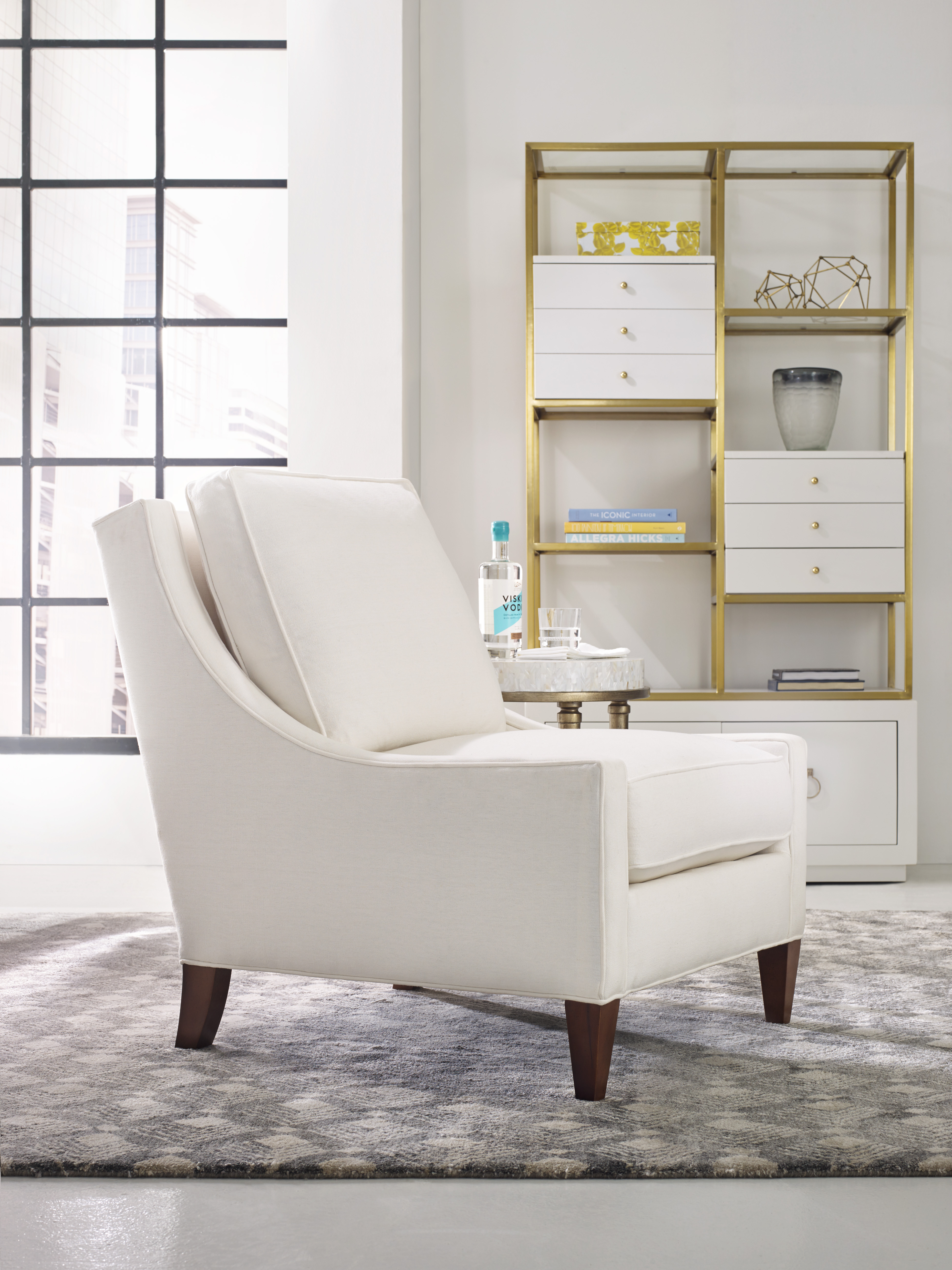
Instead of using white on your walls, why not use white furnishings? Don’t let white become your default backdrop when you can use it in more interesting ways.
White furniture can pop against a dark background. So, when you have dark walls then you’ll have an elegant vibe as you make the space more interesting with your white furniture pieces. You can also have the fireplace painted white to match your furniture set.
Your background can be black, midnight blue or the unique bottle green.
Use White as a Highlighter
This is one of the most common roles of white. You can play up the most interesting details by using white as a highlighting color. An example is when you have white kitchen cabinets surrounding your kitchen. Here, fun details can be seen as a dark-colored kitchen island and wood flooring will help in playing up the beauty of bright yellow flowers in a glass vase.
Even your appliances can now come in color to offset the mainly neutral surroundings.
Use White as an Overhead Beam
Imagine white wood beam ceilings. This single feature can already make the room. A few people may prefer the natural color of wood as opposed to whitewashed ceilings but if you want to brighten up your space, then having white ceilings is one of the easiest ways to achieve it.
Plus, a single coat or whitewashing will not completely hide the grain of the wood so it will still look beautifully natural than having to hide the wood completely with thick coats of paint.
Use White on Trimming
Wainscoting might not be that common in bedrooms but it could be a terrific and fashionable idea to work on. Wainscoting can cover a major portion of the walls then you can choose any pastel color to complement.
This duo can then be the perfect backdrop for any interesting patterns and colors that you would want to add to the bedroom.
Paint the Floor White
Sure they are a tad more difficult to maintain but white floors are super charming. They can exude a casual vibe but, at the same time, a fancy appeal that is impossible to ignore.
White flooring can also make the furniture appear floating. You can also play up the fashion in the dining area as you place the most colorful, mismatched chairs. What about white oak floors? Oh, they’re so beautiful that they exude cleanliness.
White flooring is the most excellent complement to any home’s design. These floors are your blank canvas just like white walls.
Paint the Staircase White
Why not? Amp the style in your home as you take the interior design further with white staircases. Encase the steps with glass or acrylic side panels instead of the usual metal spindles and banisters.
Go Traditional with White Tiles
And what is a bathroom without white ceramic fixtures? White is still the go-to color when it comes to cleanliness and simple beauty. White bathroom fixtures are also an excellent way to add value to your home.
Tags: McCreerys, McCreerys Home Furnishings, white, white color palette, white color scheme, white in interior design, white interior design, white interiors
Posted in Color Schemes, Interior Design 101, Interior Design Elements, Interior Design Themes | Comments Off on White Interiors – Get Ready for This Energetic Aura
Wednesday, January 11th, 2017
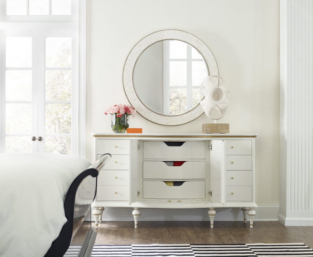
Cynthia Rowley’s Mystique Nine-drawer dresser in white sits wonderfully with all the other Nordic elements in this room.
White is the color of snow and decorating with white could mean one of two things – it could make you feel anxious or you could feel at ease. Many homeowners veer away from white because it is too stark, too antiseptic, it even makes them feel like they are inside a hospital building.
To others, though, white can be a refreshing color since it evokes cleanliness, purity, even sophistication.
Before deciding whether you would or would not use white, here are some guidelines that could help you decorate with this hue –
Think of It as a Blank Slate
Instead of feeling animosity towards white, look at it as a way of freshening things up. You could go any way you want to go, creativity wise. White rooms could inspire you to frame a scenic view of your garden outside. It could also be the canvas to beautiful stencils, stickers and photo murals.
Instead of automatically resorting to bright colored walls, see what white would translate into in your home.
White Kitchen: Traditional or Modern
White is deliciously versatile. It can be creamy and the perfect partner to wooden furnishings, thus, it is the foundation to a classic or traditional kitchen. Wooden kitchen cabinets would pair well with gleaming, white, marble counters.
Homeowners also love white because it confidently blends in a modern environment. In fact, a lot of kitchen appliance manufacturers have long made appliances in an array of white options.
Be Timeless With White
If you’ve been paying close attention to interior design trends, color pairings use grays, blacks and tones of white with metals. White has been paired with brass, stainless steel, gold and copper. This pair looks warm and inviting even when metals have reflective properties and white is crisp.
If you’re brave enough, you could also venture into white upholstery. Sure, it is more difficult to clean as it gathers dirt more quickly, but just consider which room it would go to and you could control dirt through regular maintenance.
Use white denim slipcovers if you have kids and pets in your home. Don’t let white’s stark cleanliness hamper you from using this wonderful hue.
Decorating with white doesn’t default to an all-white interior as proven by this single piece Hooker Furniture Bedroom Sandcastle Twin Wood Panel Bed.
Frame Artwork with White
One of the best assets of using white is its ability to highlight other stuff. It could emphasize personality and it won’t even compete with the other colors that you choose to use.
Sculptures, paintings and other works of art demand attention so you need a color that won’t compete with them. Here is where white would come in. You would notice how all eyes would instantly go to the artwork without you asking the guests to.
Choose from Shades of White
There are, believe it or not, hundreds upon hundreds of shades of white in the market these days; some even look closer to beige. Some even look like yellow, green or pink and this is not surprising since every color that you can find in the spectrum has a version of white.
Pick flooring, furnishings, countertops and just about anything in white for your interior design. Just be sure to layer tone upon tone for a warmer appeal. Don’t forget to add textures and patterns in similar hues in order to keep the room interesting.
A room that lacks warmth or personality needs layers of white. White hues create depth and interest. This setup works best in bedrooms as you layer the headboard, bedding and window treatments.
White makes your home versatile all year round. Whether you’re cuddling indoors with during winter or awaiting the exciting colors of spring, white will always be a welcome basic color.
Tags: designing with white, McCreerys, McCreerys Home Furnishings, white in interior design, white interior design, white interiors
Posted in Color Schemes, Interior Design 101, Interior Design Themes | Comments Off on The White Décor: Exciting, Docile and Many Things in Between
Thursday, November 17th, 2016
Fine Furniture Design Bedroom Bamboo Drawer Chest 1050-116
What did you feel when you last saw an all-white home? Did you feel relaxed or was it the opposite? White is a color that most homeowners would just use to mix with other colors but using it – on its own – is not something that many would venture to. A lot of people are nervous about the use of white especially when they want their home to look homier. Yet white can be a refreshing color compared to many other colors on the spectrum.
White evokes cleanliness, purity, even sophistication and confidence. Prior to using white in your home, be sure to check out the following tips first –
White as Clean Slate
Instead of feeling nervous about white, look at it as a way to achieve a fresh start. White can release your creativity without you even becoming totally aware of it. A white room is a wonderful way to decide what inspirations you have for your room. For instance, if you have a scenic view from the living room, then it would be a great idea to frame this in white walls. There is nothing more beautiful than white as a backdrop for the most gorgeous vistas.
Know also that there are different shades of white that are not automatically beige. Every hue, in fact, has a corresponding white tint, from yellows, pinks to purples and greens.
White on Upholstery
Sure, white upholstery is a bit more difficult to clean as it gathers dirt more quickly, but using white in this case means knowing what fabric type to pick. Having children and pets in your home would call for sturdier fabrics such as khaki or faux suede. There are also slipcovers that are now made with white denim so find out if that’s also suitable for your active home.
Let Art Do the Talking
A great asset that you can actually show off using a white wall is an interesting piece of art. Show your personality by putting up a framed painting or any interesting piece of art on the wall. Such pieces command attention and adding the bareness of white make them the perfect focal points in rooms.
Use Tone-on-Tone Layering
Should you ever feel that your room lacks warmth or personality, think of layering the whites in like shades. Use warm whites and warm grays, for instance. Use textures and patterns that are similar to the white hues that you used.
White Spells Versatility
White will always be a rich canvas where you can decorate and style all year round. Whether you’re ushering in the winter season or welcoming the advent of spring, there will always be shades of white that go well with the interesting colors of the season.
White can also be used to frame interesting architectural features. For example, an all-white bathroom would effectively highlight a colorful vanity table. With the right accessories, white can actually look cosmopolitan, even sophisticated.
Risk aversion or veering away from idea overload is also the role of white paint. As a homeowner, it is often easy to get lost in the trendiest interior designs. If you want to have a more grounded setting, then use white to anchor your most interesting designs.
White Means Erasing Blemishes
White is an eraser of any architectural error – from blemish on the drywall to exposed ducts. White is an effective way to camouflage eyesores. If you’re living in an older home, then this can also highlight the most beautiful crown molding.
Use white to transform your home to the modern minimalist, classic neutral or traditional setting that you dreamed it to be.
Tags: McCreerys, McCreerys Home Furnishings, neutral, neutral colors, neutral hues, neutral interior design, neutral interiors, neutral palette, white, white color palette, white color scheme, white in interior design, white interiors, white palette
Posted in Color Schemes, Interior Design 101, Interior Design Elements, Interior Design Themes | No Comments »
Tuesday, July 19th, 2016
1118CR Delancey Club Chair 1586-10443-WH3 Swan Room Divider with File Storage
Who cares if it’s another season and you’d want to feel the warmth of summer in your home? Just picture the beauty of this sunny season, from curtains billowing in the gentle wind, shell décor, freshly-squeezed orange juice, and such, and you would be begging to get into the summer vibe straightaway.
If you’re ready to jump into the summer routine, here are ways to get crafty and creative –
Outdoor Curtains Are In
What could be more summery than white curtains hung outdoors? Add these ASAP to your lovely porch, they are the perfect provisions for privacy and a little shade.
Pearly Shells and Flowers
Begin your decorating project by filling up, partway, a huge glass vase with sand. You can then add shells that you found on the beach to complete this summer decorative piece. If you have kids, have them help out in filling up the vase with their own shell picks.
If shells don’t tickle your fancy then you can always add wild flowers into the glass jar instead. Snip some flowers from your own garden and have them fill a jelly jar. This is the natural alternative to buying those bottled potpourri in shops.
Fun and Calm
What was that again? Yup, you can actually have both fun and calm on the same deck. Place colorful cushions, your guitar on its stand, and your collection of pottery out on your deck. This is the perfect setup for a series of relaxed afternoons in that area.
‘Want to hold parties instead? That’s possible, too. Invite your friends and have a fun party right by the deck.
The All-Summer Bar
Set up a lovely tray complete with some glasses and lime – these are the starter pieces for your summer bar. Add a few summer drinks that you love and – voila – you have an instant bar right in your home.
‘Want to set up the bar outdoors? Then do so. A cabana would be the perfect alternative to a corner bar in your home. Hang a colorful swinging chair to complete the theme.
Speak of outdoor changing area, if you happen to have a pool in your backyard, then it would also be handy to have a changing booth right outside. Be sure to stylize this booth in your home, too.
Summer Spells Remodeling
Remove all sorts of clutter in your home, especially from the kitchen cabinets. Have the unused pieces donated or handed down. You will be amazed at the amount of breathing space that you’d be able to create with some cleanups.
As soon as you’re done cleaning, you can then bring in a visual masterpiece such as well-chosen driftwood. This cool chunk of wood can be placed as a decorative piece on the coffee table or in your bookshelf.
Summer Colors Only
It’s only logical to use lively colors when setting up a summer-themed home. Use blue as it is the perfect representation of the color of water. This offers a calming and cooling effect that is very gentle to the eyes.
Orange tones also work because it is as energetic as the rays of the summer sun. Use it with yellow or red to bring a zing to your home.
Whoever thought soft gray could also work on a summer theme? Its neutrality will add that classic touch to the bright yellows that you bring in. This gives any home a concrete-like vibe so it is a convenient and cool foundation to your summer elements.
Pink is a standalone color that will create an impact that’s difficult to forget. Use champagne pink or hot pink to complement the summer hues all over your home.
The Beach Theme
You can never go wrong with white and blue stripes when it comes to summer design so go ahead and freshen up your bed with these crisp stripes. This fusion of colors provides the needful beach house elegance so shop around for the coolest bedding and accessories.
Bring in a surfboard, roll up some beach towels by your front entrance, have everything as bright and sunny as your disposition and, yes, no one can beat your lovely summer theme.
Tags: McCreerys, McCreerys Home Furnishings, tips, white, white color palette, white color scheme, white furnishings, white in interior design, white interior design, white interiors, white palette
Posted in Color Schemes, Interior Design 101, Interior Design Themes | No Comments »
Monday, May 9th, 2016
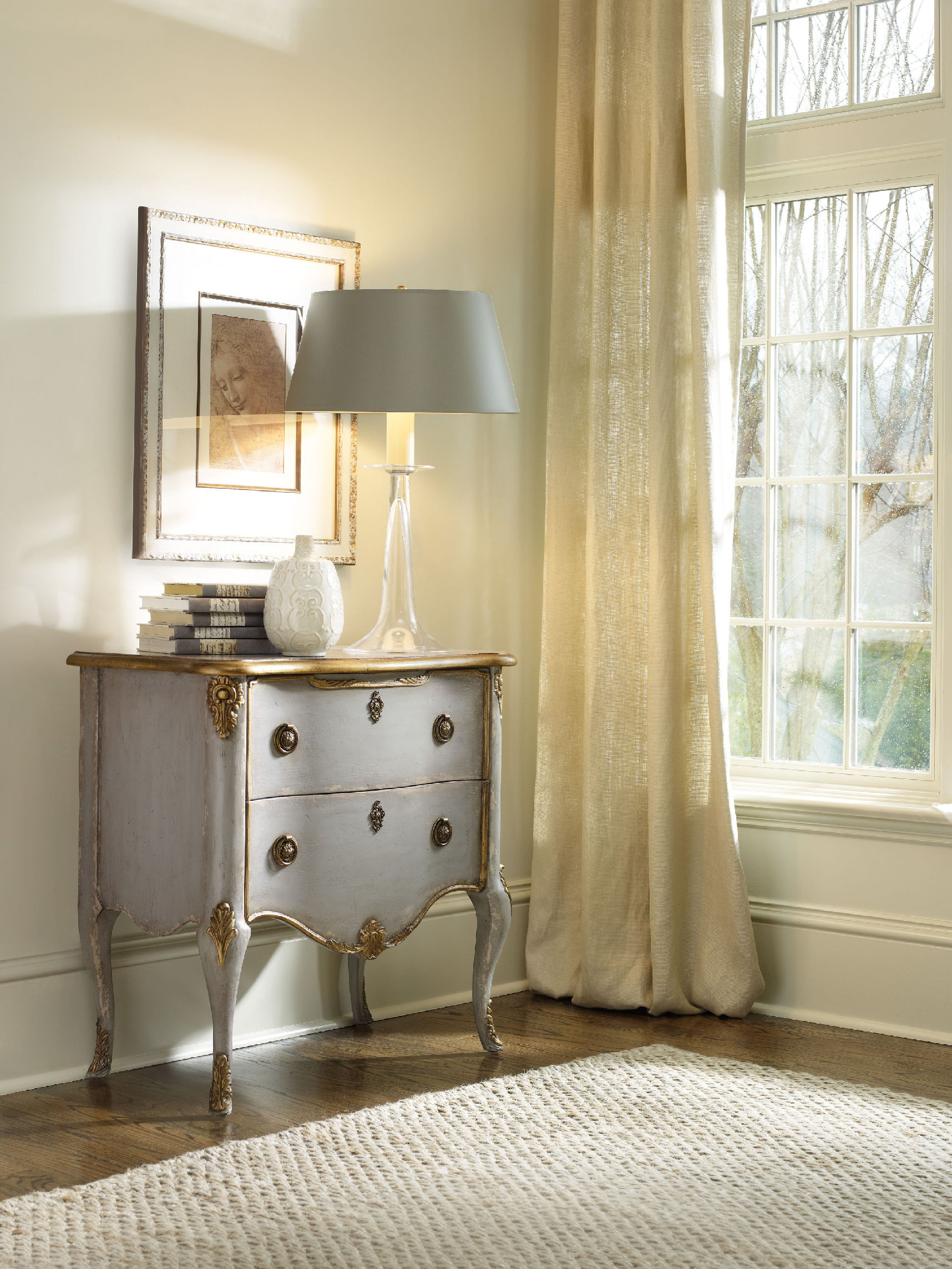
Hooker Furniture Living Room French Two Drawer Chest offers a distressed yet elegant optimization to the white walls.
There are many ways of freshening up a home in terms of its overall look. If you plan to level up on your cleanup, there is a clean-slate strategy that is hassle-free and safe. Painting your walls white is a technique that will make your home into a blank canvas that is ready to be doused with your personality.
A Word of Caution
Before you delve into this undertaking, you might want to look into the possible effects of the color. First, white paint may be the magical solution to many homes that want to start anew but it can also be a cold, unfeeling color.
Just like any other color, consider white to have its own temperature, lighting requirements, mood, even style. It has – more than any other color – maintenance requirements as well as a rich history. If you make the mistake of ignoring these elements, then you end up with a stark color as opposed to the clean, crisp hue that you wanted.
Do not be afraid to use white, though. Most of the time, all it needs is just a dash of another hue to tone down or warm things up.
Room Considerations
Prior to painting your home white, you must take a careful look at its orientation. Those rooms that turn away from midday sun have a gray-blue light. These rooms are great for summer bedrooms, a studio or a gym. This is so because the sun’s angle at this point provides the needed consistency.
White paint tends to optimize the lighting in these spaces. While it works in these rooms, white won’t work in rooms that face the north. White will link the snow-laden outdoors to your home without being visually distressing.
Use red, orange or yellow tint with white when you paint the areas of socialization and dining. Rooms that don’t have a direct access to natural light are the best candidates for these color fusions. The warmth of yellow, orange and red will make up for the heat lost from the sun. These colors are also known to raise blood pressure, thus, upping your level of activity and positive vibe.
Scientific evidences have proven that colors can create a certain psyche, in this case, the warm colors make the body feel heat even in the absence of real warmth.
Rooms that face the south are the ones that receive the most amount of sunlight during the morning. Summer or winter, this side of your home will receive a red-yellow sort of light during a clear day.
White-painted walls will cool such spaces while not limiting your color choices. You can still adjust the glare by looking at your pigmenting options. An example is using gray to soften the reflective property of white. This combination should create a hush-hush feeling inside your living space.
One color choice will not be able to offer the lighting changes required in different seasonal circumstances, however, there are times during the day also certain seasons when rooms get the most lighting wear.
It is during such times that you should dampen or radiate the natural light that comes in. To do this, choose a conditioning color that you can use with white. Cool colors include green, gray and blue tones while the warm ones are orange, red and yellow.
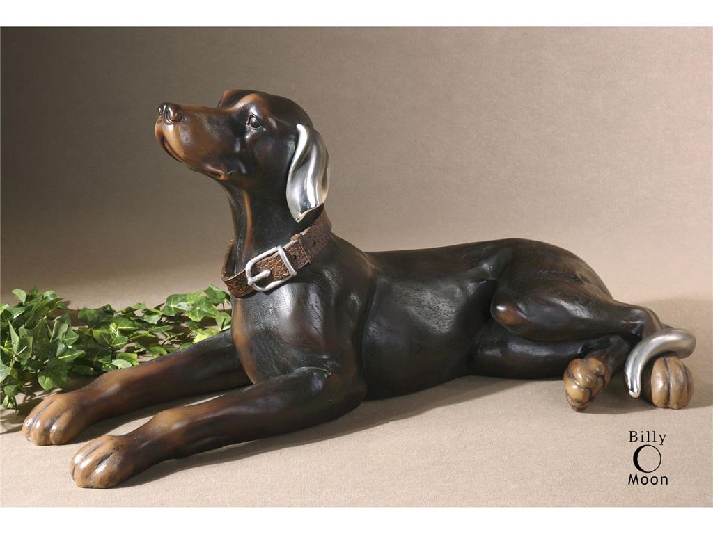
The Uttermost Accessories Resting Dog, Statue 19070 offers an amazing contrast to the starkness of white.
Outside-In
Remember that the outdoors can greatly affect what you have inside. If you have an awesome view of the ocean outside or, perhaps, a beautiful garden, then use it to your advantage. White walls will be able to enhance such picturesque views. White is the perfect solution for that much-wanted year-round shoreline view. You can enhance the view by fusing white with just a small quantity of yellow-orange pigment. This combination should frame the coolness of the view outside.
Now ain’t white beautiful?
Tags: McCreerys, McCreerys Home Furnishings, neutral, neutral colors, neutral hues, neutral interior design, neutral interiors, neutral palette, white, white color palette, white color scheme, white in interior design, white interior design, white interiors, white palette, white walls
Posted in Color Schemes, Interior Design 101, Interior Design Elements | No Comments »
Tuesday, February 9th, 2016
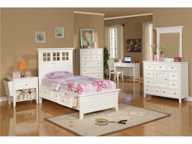
Scandinavian theme can be used as well in the kids’ bedroom (Winners Only Bedroom Del Mar White Twin Storage Bed BDP1001TS).
What do Iceland, Denmark, Sweden, Finland and Norway have in common? All these countries showcase perfect homes. Spaces featuring Scandinavian design are super stylish but not in an ornate kind of way. Also known as the Nordic design, Scandinavian design is all about keeping most design elements subdued. More often than not, such homes sport a stark white backdrop which is the best canvas for anyone’s artistic flair.
Scandinavian Design: A History
Simplicity and function are the foremost design principles for all of Nordic Europe. The homes in these places are airy, bright, and mostly serene. Natural elements are effectively used, with neutral color palettes taking centerstage.
The world had its first glimpse of this style during the 1947 edition of a design exhibit in Milan. Triennale de Milano specifically featured home accessories and glassware coming from the Nordic nations. It was a rage and pretty soon, Canada and the U.S. capitalized on its popularity. The years 1954 through 1957 made Scandinavian design the star of the interior design industry. It was a timely break from the designs enjoyed by Europeans during that time. Europeans generally favored ornate designs and opulent settings. Nordic design changed all these.
Function over embellishments became the new trend.
The design’s popularity declined during the 80s but upped again in the next decade.
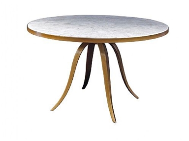
Artistica Dining Room Crystal Stone Round Dining Table 373-100.
The Scandinavian Textures
It is important to play with textures when you are designing your home with a bare white environment. The colors can still participate in the whole picture but they should be muted. Rich textures must be seen on the furniture pieces, lamps, the accent rug, textiles, the bed and the couch. The secret is to keep things exciting.
Mix rich textures with a little shimmer or a touch of nature (as simple as a flower arrangement inside the living room will do wonders). A bit of black will also look nice as it will provide a striking contrast to the white background.
Colors can be added one bit at a time. Abstract paintings are a nice addition; they will surely pop in a mainly neutral space.
The flooring does not have to be white, too. If you do not want the flooring to appear sterile or too cold, then you may install wooden flooring. If you love dark colors, then don’t worry. You can still use such colors without making the room look gloomier. Begin with an accent wall then work the rest of the design from there.
Scandinavian Furniture
Wood is a primary feature of many Scandinavian homes. Life in that region of the world has long winters and just a few hours of daylight. Since this is so, people often stayed indoors for a long stretch of the wintry season. Small houses featured wooden furniture pieces that were masterfully crafted by artistic hands.
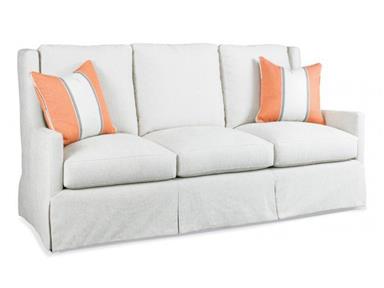
The Hickory White Living Room Sofa 5104-05 has throws that make a colorful and interesting contrast to the all-white fabric.
Scandinavians love organic materials such as natural wood, metal, leather and natural textiles such as cotton and linen.
Statement pieces such as tables and chairs do not even have to match. You have the leeway to mix and match different pieces to make the dining space look more interesting. Natural materials like oak, suede, leather, linen and cotton comprise many Scandinavian furniture pieces.
Leather furniture is also welcome in a Scandinavian setting since it can effectively add warmth and texture. To complete the elegant look brought about by the wooden and leather furniture, see if you can have a fireplace in your living room. A column fireplace can be used as a focal point in a huge living room or in a family room. More often than not, the fireplace is just a bunch of columns located in a corner of the room.
Tags: leather, leather furniture, McCreerys, McCreerys Home Furnishings, Nordic design, Nordic interior design, Nordic interiors, Scandinavian design, Scandinavian interior design, Scandinavian interiors, white, white color palette, white furnishings, white in interior design, white interior design, wooden, wooden furniture, wooden materials
Posted in Interior Design Themes | No Comments »
Follow us on our social media
© McCreery's Home Furnishings | All Rights Reserved | Privacy Policy