- Follow us:


Thursday, August 31st, 2017
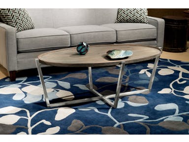
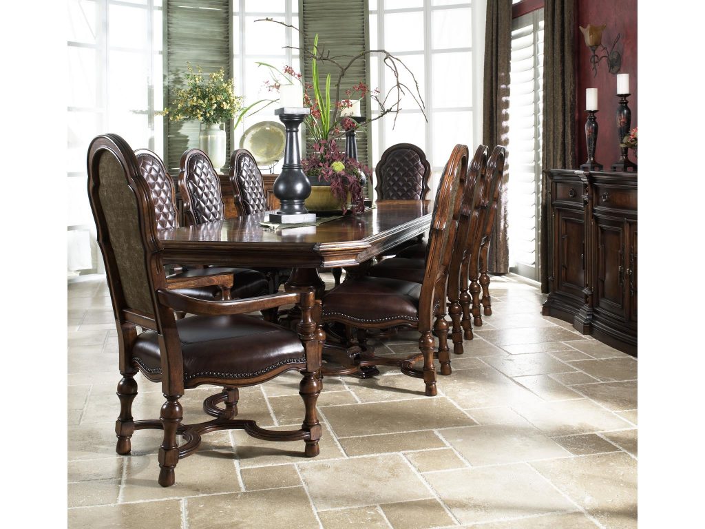
Flexsteel Living Room Oval Coffee Table W1433-033
Eclectic style may not be for everyone but it is a design that one can easily adapt to. Eclecticism is not easy to achieve. If you want to use this style in your home, then you had better be prepared to learn some rich history, the philosophy behind it, and why it is one of the most unique interior designs that one could ever use.
Eclecticism History
It was during the 19th century that eclecticism became highly known. Victor Cousin defined it as the selection of systems that are good and true and are potentially everlasting. He also longed for the moments when great schools peppered the earlier periods – all the things that are philosophically taught among the Scottish, French, and Germans.
Eclecticism was mainly an architectural design wherein one piece infuses many other elements from different historical styles. In our time, this is something that is nostalgic while being a melting pot of many cultures and time periods.
Eclecticism in North America has also profoundly affected architecture. Architects who finished their education in Paris, more specifically in Ecolé des Beaux-Arts, were the ones who spurred eclectic architecture in America.
Skyscrapers, courthouses, churches, libraries, city halls, and movie theatres were popularly designed with eclectic elements.
Ocean liners also became the home for many eclectic designs. This is mainly due to the people’s wish that they are reminded of home when they spent days to weeks traveling abroad.
What Is Eclecticism?
So what really is eclecticism?
It is a style that enforces creative freedom. It is a style that has zero guiding rules. The chances of creating a thing of beauty are high as is the risk for having an unsuccessful design. Remember that eclecticism, though without rules, is still an interior design style. This means that the other design elements have to harmonize.
Eclectic Layout
When you are designing an eclectic space, remember that it is so easy to get lost in the varied styles and periods. You could also end up being confused between Mid-century and rustic styles. While it is great to think outside of the box, you must tread this path with care.
Search Google and you’d immediately see hordes of eclectic house plans. One thing that you’d notice is that all these spaces have furnishings in proper placement.
The furniture layout must be comfortable (as comfort is always key).
Eclectic Focal Point
What is an eclectic home without a focal point? It could easily be that quirky chandelier that you bought years ago. Bring it out and find out how you can use it to brighten up your unique home.
Design around the layout that you initially made. While there can be different styles fused, make sure that you don’t lose focus. Create a focal point that highlights an existing one. This can be the accent wall, a fireplace, or that bold decorative piece.
Eclectic Function
As you find proper décor, do not forget that you will live in this home together with your family. Consider having bookshelves, tables, baskets, and trays for all your storage needs. These elements do not just store stuff but they also provide your home with a lived in appeal.
Eclectic Uniformity
Okay, don’t be confused. You’re not asked to match everything. Eclectic is naturally varied, true, but all the pieces are still complementing each other. Your place is sure to look disjointed if the design elements do not harmonize in any manner.
The simplest way to achieve this is to have a single go-to hue. This will serve as the color that will pull everything together. Remember, you must always return to this color whether you’re picking your decorative items, furniture or wall color.
Tags: eclectic, eclectic design, eclectic interior design, eclectic interiors, eclecticism, McCreerys, McCreerys Home Furnishings
Posted in Interior Design 101, Interior Design Themes | Comments Off on Organized Chaos – How to Make Eclectic Design Work in Your Home
Wednesday, August 30th, 2017
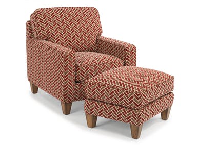
Flexsteel Living Room Fabric Ottoman 5720-08 offers the most colorful geometric addition to your living area.
Mathematically speaking, geometry is a branch of math that focuses on the relations of lines, points, solids, surfaces, etc. In 2015, geometric patterns became quite hot in interior design. They popped out in nearly every new home and they were even the stars of many TV shows and magazines.
Geometric patterns are lovely. There is no reason why you should not be able to embrace them as a part of your interior design. When done correctly, they can give your home a polished look.
Goin’ ‘70s
If you have an eye for trends, then you would know by now that what’s fashionable in interior design is also hot, hot, hot in the world of fashion, art, and beauty trends. These share things that are popular and they immediately incorporate what’s in inside homes, on runways, and on canvas.
When talking about popular designs, it is easy to understand why geometric patterns remain hot. Whether you’re eyeing simple, small or large patterns, you will definitely give your home a more refined look compared to its other traditional counterparts.
What’s popular is also recurring. Ask people who have been around for many decades and they’d tell you that the styles are just repeating. What’s fashionable during their childhood might be fashionable again now.
The modern interpretations have a fresh twist, though. What’s hot these days is the groovy look of the seventies.
Geometrically Interesting
If you want to achieve a look that seems to leap out of an interior design magazine, then you have to add splashes of visual interest to your home. You wouldn’t want to bore your visitors with a space that has nothing but neutral-colored walls, flooring, and furnishings.
Geometric patterns are critical when adding visual interest. Your home can look modern, eclectic or even traditional, it depends on how you present the patterns that you have chosen.
In picking the right geometric design, be sure to use one that has the basic colors that you already have in your interior design theme. Your color scheme should dictate the patterns’ hues. Also, be sure to pick the correct print size.
You would not want to overwhelm people in a small room with huge patterns. Don’t forget to choose a pattern that you have also fallen in love with.
Just a Little
A great interior designer would know that design elements should work together. There must be pieces that play the dominant role and the others are just there to highlight these very pieces.
It goes without saying that geometric patterns must be used as accent pieces. It would be wrong and confusing to have a room full of geometric shapes and patterns. In essence, your visitors’ eyes will not cease to look and look and look some more.
Focus on having the design elements that will be framed by the geometric patterns.
Geometric Applications
What’s great about geometric patterns is that they can actually be used anywhere. So, yes, they can be used in the busy living room, the dining and kitchen areas, as well as the quieter rooms such as the bedroom or the home office. Just make sure to use smaller, more subdued patterns when you use them inside rooms where you’re supposed to rest.
To create a more dramatic statement, you can place the geometric patterns on one huge design element in your space. The cool floors could be warmed up by a geometrically interesting area rug.
Conclusion
You should not be intimidated by geometric patterns. They are hip, they can be sassy, they can be cute, or they can be theatrical. Do you love geometric patterns? Let us know in the comments section below.
Tags: geometric design, geometric elements, geometric interiors, geometric patterns, geometric style, McCreerys, McCreerys Home Furnishings
Posted in Accents, Interior Design 101, Interior Design Elements | Comments Off on Geometrically Fantastic
Tuesday, August 29th, 2017

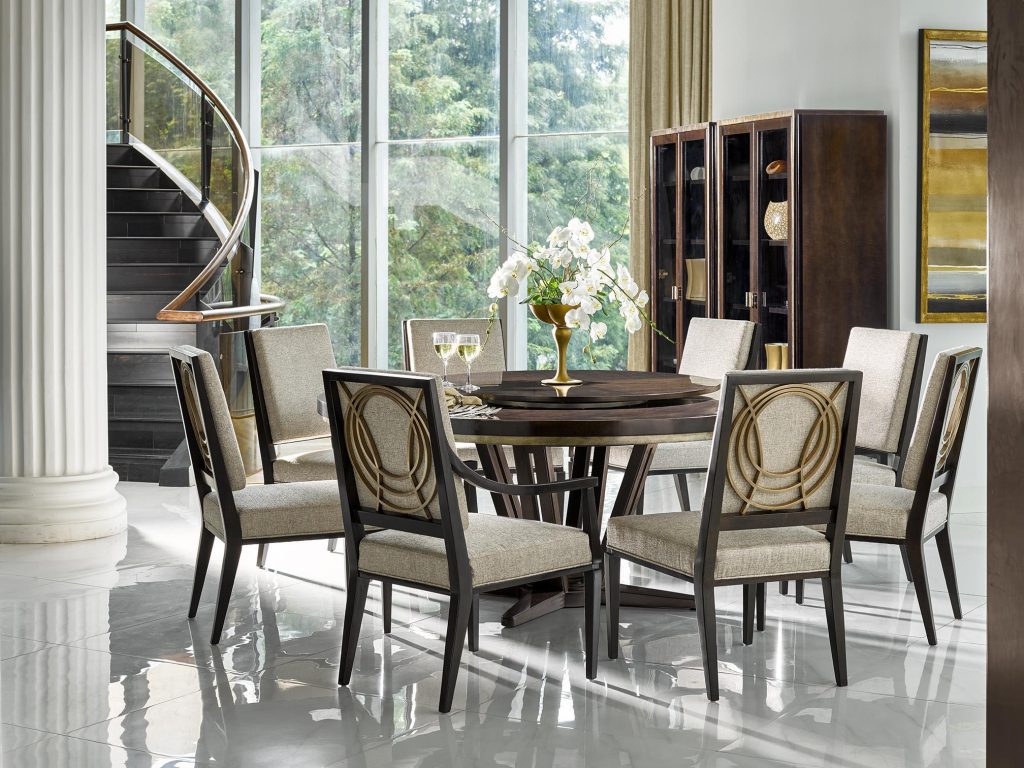
Hooker Furniture Living Room Carlisle Power Motion Sofa with Pwr Headrest: This room evokes power and drama because of the dark walls, dark accents, and the equally dark furniture choices.
Color is a powerful tool that designers and homeowners have been using to beautify homes for many years. Hues are also stimulating, soothing, healing, though they can also excite or even terrify. If you happened to paint the walls in your home then you find out that the color doesn’t jive with the rest of the décor, then you’re up the creek.
To make the right choices with warm colors, there are some simple things that you need to keep in mind –
Differentiate Warm from Cool
The color palette for interior design is divided into the warm and cool colors. The most obvious warm hues include yellows, oranges, and reds. These colors are directly opposite the cool colors comprising blue, greens and grays.
Where these colors meet, these are what you would refer to as a hybrid. Purple and green are hybrid colors and they can both be warm or cool depending on how light or dense the mixture is. Lime green, for instance, contains a lot of yellow so it is considered warm. Kelly green, on the other hand, has more blue so it is considered as a cool color.
Warm Colors Stimulate
How do you think you’d feel inside a bright red room? Exactly.
Red is the color that is often associated with war, energy, strength, danger, desire, passion, determination, and love. It is also known to increase human metabolism as it can also raise blood pressure.
Red is a dynamic color. It represents energy and aggression as it can easily raise anyone’s heart rate. Just place red in the middle of a neutral background and what color would your eyes go to?
Red, of course.
Orange, on the other hand, is the combination of yellow and red. This is often used to draw attention which is why it is used on traffic signs. Businesses make good use of this color because it enhances energy and activity.
Orange is widely used as a uniform color for many sports teams. If you want to motivate your team, then have orange plastered all over the walls. If it’s too bright for you, then at least use some orange accents.
Yellow, in color psychology, means optimism, happiness, and enthusiasm. It is no less than the brightest color on the spectrum. Yellow is upbeat and fun. It is cheerful and it is also the color of hope.
If you’ve noticed, the basic warm colors work best in social rooms. So, if you’re thinking about using warm colors, then it is best to use them in the dining room, the living room, and as well as the kitchen.
Black and White: Warm + Cool
While black and white may not be considered as proper colors, they are widely used in many homes – and successfully so. Black with its warm properties pairs well with white and its cool properties. So, if you paint an entire room white, it will be a stark, cold-feeling room unless you do something to counteract this.
Black is always warm so use it sparingly. It can easily overwhelm so just use a little black and you’d never go wrong.
Warm Color Consistency
Always remember the effect that you would want to achieve in the room. This is the only way that you can define whether you’d use predominantly warm colors or if you need to resort to cool ones. This only means that you must learn to use warm effectively so that they won’t clash with the cool colors.
If you have a warm-colored floor (wooden flooring), then you shouldn’t paint the room green. Do this only if you would want to the room to look off beat.
Tags: McCreerys, McCreerys Home Furnishings, warm colors, warm hues
Posted in Color Schemes, Interior Design 101, Interior Design Elements, Interior Design Themes | Comments Off on Hot, Hot, Hot Colors – _ 4 Guidelines in Using Warm Colors
Friday, August 25th, 2017
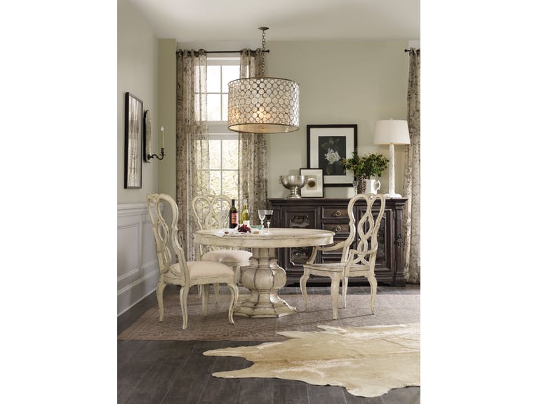
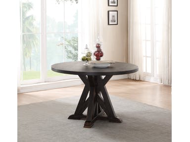
Deco Le Cercle Round Dining Table 60″ sits beautifully inside this high-ceiling home.
Are you running low on your creative juices lately? Then, perhaps, this is not the right time to take on the decorating project for your home with high ceilings. Not only is this interior design project challenging, it can even get tricky. Yet with the right guidelines, you should be able to take this task head on.
Remember the Rule of Thirds
What is this? Just like when you’re doing photography or painting, you will need to visually divide the object into three equal parts. In this case, you will need to visually split the wall. Starting from the floor up, imagine the room as having three design levels.
Have the first level adorned with judges paneling. The second level should be reserved for paintings while the third must be left alone. Yes, remember this – it must be left on its own.
If you’re confused about where to place your furniture, then know that the bottom third of the levels is reserved especially for this.
The key is to create focal points and to take the mind off the fact that the ceilings are way, way beyond anyone’s reach.
Lighting Helps
While others may tell you that there is no need to spend much just to buy some lighting fixtures, the truth remains that lighting is a powerful tool that can make or break the vibe that you would want to achieve in your home.
Make a bold statement by paying attention to the focal point in every room. Use lighting to subtly divide some areas. For instance, having three pendant lights in the living room can visually divide the entertainment space, the reading nook, and the path leading to the entryway.
Use Art
Paintings are never an option when you have to deal with high ceilings. Simply put, paintings can add life and elegance to any space. There are some people who may not recognize the beauty of art galleries, so if you’re confused or if you don’t want your space to appear like a museum, then place the paintings according to your liking.
Just be sure to place every piece at eye level. Highlight every possible space that you want as you hang and group the most interesting paintings.
Use an Accent Wall
Color is an effective way to accentuate the high ceiling. This is if you would want to revel in the beauty of having a home with high ceilings. Paint just one wall with a different, bold hue as you leave the others bare or with a neutral-colored paint.
This space will surely get a new look and one that has a unique personality.
Curtains for Hominess
Your tall space can instantly feel homier if you add floor to ceiling curtains. These curtains will achieve a breezy feel. If you want a punch of energy, then you can use red and other darker hues. These colors are known for their dramatic effects on design.
Black furnishings will also make the rooms feel smaller, thus, your home will be cozier. This is if you don’t want to emphasize the beauty of having, say, cathedral ceilings.
For harmony, make sure that you repeat the drapes’ colors elsewhere in your space. Patterned designs might be a tad more difficult to infuse in your design but it will surely give an interesting diversity to your setup.
What to Do with Exposed Wood Beams
More often than not, high ceiling homes have exposed wood beams. This is because they are known to visually reduce or minimize the tallness of the structure. Don’t be rattled – these are the very elements that make your interiors unique.
Tags: decorating high ceilings, designing high ceilings, high ceiling, high ceiling design, McCreerys, McCreerys Home Furnishings
Posted in Architectural Elements, Interior Design 101, Interior Design Elements | Comments Off on Tall Tales: Designing a Space with High Ceilings
Thursday, August 24th, 2017
Hooker Furniture Dining Room Auberose 52in Round Pedestal Table: Do you need help achieving this look? Find the best team members to help you achieve this.
Does your home now have a tired look to it? Or are you simply tired of the old furnishings that you see day in and day out? Wanting a new look should always begin with a dream.
Plot Your Dream
Way before you even sit down and consult an architect, you must start by sketching your design ideas. Imagine the layout, the new furnishings, and the reasons behind your remodeling project. If this project is for room expansion, just think about how space can be used and how the traffic patterns will be altered.
Consider also whether you would build something from scratch and how that can affect the overall construction of your home. Think about how an oversized addition can overwhelm small square footage.
Make use of a home design software so that you can visualize your project.
Ask Around
Why go through the same mistakes that your friends or neighbors have gone through? It is best to learn from others who have renovated their homes before you did. There are many websites that show the developments of home improvement projects.
Plan Ahead
You may be dreaming of a more spacious home this time but hold your horses first. This renovation project may not be sensible if you decide to sell your property in a year or two. That luxury bathroom may even make your home valued above most of the properties in your neighborhood, thus, making it more difficult to sell.
There are even some home improvement projects that can lower the value of your home. Learn about Queen Anne, Victorian, and vinyl siding.
See also how your family’s plans might vary in the coming years. Every remodeling project has its corresponding budget requirement. Calculate yours before the first nail is even driven. Before you nod to that bronzite countertop, why not settle for the equally durable but less pricey one?
Pick Your Team Members
It is impossible to take on a whole renovation project by yourself. Of course, you will need some professionals to help you on this task. Naturally, you should look for the ones who are properly insured and licensed. Home remodeling jobs are risky so you have to do your part to protect yourself from any shocking expenses.
Looking for the best team is not all about doing a basic reference check. Consider the fact that the top architect may not share your vision for your home. An older house requires a professional who knows how to deal with period homes.
Discuss the Contract
Whether you are renovating full-scale or are just going to do some carpentry basics, this project will require the services of both an architect and one general contractor. Any misunderstanding with either of these guys can spiral into a disaster.
To avoid such scenarios, you need to have a written contract that will cover both parties. Make sure that every team member signs and agrees to the said contract. Above anything else, you have to be certain about the types of materials that will be used, the duration of the project, etc.
Don’t agree to any verbal agreement. It is always safe to have everything written even if you trust the architect, general contractor, and the interior designer.
Do the Paperwork
Interior design reboots also require a lot of paperwork. You’ll need a permit so your renovation project can legally push through. A building permit may just be a piece of paper but it’s a piece of paper that assures you that the structure to be built will meet codes as well as all safety regulations.
Always Have a Plan B
Small or big, your remodeling project must come with a backup plan. Make room for delays, miscommunications, shortage of supplies, and equipment breakdown. Set some rules for your team members so that the project can run more smoothly.
Tags: home remodeling, McCreerys, McCreerys Home Furnishings, remodeling, remodeling project, remodeling requirements, remodeling your home, remodeling your house
Posted in Interior Design 101, Interior Design Elements, Interior Design Themes | Comments Off on Interior Design Reboot
Wednesday, August 23rd, 2017
Viniterra Host Arm Chair
When talking about style, it is impossible to not think about the French people. Everyone wants to dress up like them, dine like them, and basically live fabulously as they do. So what is the secret to designing a Parisian home?
French Is Bold
When you’re out to decorate your home like the French, you should be ready to experiment and be bold. Do not be afraid to commit mistakes especially when it comes to mixing design elements.
French Is Chic
The French people like to keep things simple yet you can still see that they remain chic. They make good, elegant use of the neutral color palette. They want to keep things uncomplicated. They are always known to achieve balance since they effectively use design elements that do not clash.
French interior design is simple and easy to live with. It is easygoing and it does not require much thinking. What you need to do is just walk into a house, understand its architecture, place the essential pieces, and then feel peaceful within.
French Is Vintage
France has a rich history. Just look at their renowned museums and their architectural wonders. Just take a stroll down the streets of France and you will learn about historical facts without even trying. It is also very French to mix provenance with modernism. For instance, gilded bronze hardware, vintage pieces, and parquet floor are all French elements and they look perfect all together.
French Is Fusion
Remember the reminder that was given to you earlier? That you must not be afraid to mix styles and design elements. So this means that you can mix contemporary design with Old World elegance. Be able to stimulate the senses using your willingness to bend to different tastes that actually work well together.
Interior design themes aren’t the only things that you can fuse with this style. The truly French-inspired folks will know that the refined can be mixed with the rough elements, meaning, the artsy objects can be mixed with the neutral elements.
You will simply love the idea that you create diversity and intrigue even with the simplest elements.
French Is Whimsical
The French also love to infuse elements of fun into their artworks. And since the presence of art does complete any home, you should also make it your goal to make good use of art in your interior design. Be sure to balance the whimsical elements with things that are serious, though, so that your home won’t end up looking quirky.
French Is Layered
The Parisian markets are known for their lovely furniture, jewelry, paintings, lights, sculptures, mirrors, décor, silverware, and other lovely stuff. These gems should be displayed and layered all throughout your home.
Layering is an effective way of adding a sentimental touch as well as visual interest in your French-inspired home. There are no rules set in stone when it comes to the layering technique.
French Is Opulent
Paris is no less than the most romantic city in the world so you have to set up a home that reflects just that. This means that you home must be filled with charm. And what better way is there to make a place more charming than to add gold or gilded bronze pieces?
Love the amorous interiors and build it further by adding blush pieces to the whole melting pot.
What Is French Provincial?
French provincial furniture is a piece that looks antiquated. It was actually an inspired style that made use of other concepts from the Parisian style and the French royal pieces. This style was actually made especially for the middle-class.
French provincial has inspired antique repros all over the world. Only the experts will be able to tell the difference. So if you want to stage a little French provincial look, then buy the antique looking pieces.
Tags: French design elements, French interior design, French Provincial, McCreerys, McCreerys Home Furnishings
Posted in Furniture, Interior Design 101, Interior Design Elements, Interior Design Themes | Comments Off on La Vie En Rose: Lovin’ Your French-Inspired Home
Tuesday, August 22nd, 2017
The Hickory White Bedroom Upton King Upholstered Bed 585-25 can be easily shared by a couple. It comes in a color that’s perfectly gender-safe.
Interior design is both a form of art and science. It makes use of principles such as balance, contrasts, patterns, textures, and hues. When it comes to colors, there are just too many to choose from. So when you’re planning on changing the color of your walls, you could begin with a dilemma – what colors will I choose, the calming or energizing hues?
The colors orange, red, and yellow are known as the warm colors. They are called as such because they are literally the colors of fire. These colors make walls feel closer than they really are as they seem to come forward.
These energizing hues are used most often on upholstery and accent pieces. If you want a room to appear cozy, then just add a splash of red, orange, or yellow somewhere.
That Warm Room
If you are about to decorate a well-lighted, huge room, then what you need are warm hues. These are the very colors that would add a welcoming vibe.
Begin with warm neutrals on the walls. Use warm gray, taupe, or a warmer, yellow-toned shade of white. Pick any natural-colored sofa to harmonize and add richness to brick walls. If your place happens to have a brick fireplace, then emphasize the redness by using this vibrant color as your anchor.
Place custom throw pillows that blend well with the sofa fabric. Use also an area rug that picks its color from the walls or the brick red beauty of the fireplace. Always make sure that the reds harmonize with the wooden elements especially the hardwood floor.
If you’re feeling more adventurous, then paint the walls crimson. This is the most dramatic statement one could ever make.
The Warm Accents
If your home is not big enough to let in a generous amount of light, then your better choice is to limit the use of warm colors to mere accents. This is the best way that you could go if you want to make a design statement.
Have a lighter neutral on the walls. This could be cool gray or white, while you can cover the sofa with navy blue fabric. As for the chairs, use a hue like medium gray. Have the wall hangings in red, bright orange, yellow, or even the fusion of all these three.
Understanding Opposing Spectrum Colors
Being able to understand the terms that matter when it comes to colors is a huge step towards using them effectively.
Warm colors can make you feel warm, like literally and figuratively. These darker colors are often used inside huge rooms so they can look cozier and homier. Brown and terracotta plus other hues such as these can stimulate. It is this very reason why they are used in rooms that are in need of movement and increased activity.
You might be interested to know whether you really feel cooler or warmer when you use certain colors. Try living in a room painted in jet black during the hottest summer months and you’d know that it’s just the wrong color option at that moment.
The psychological effect of warm colors is even more important than the temperature that they evoke. Just take red, for instance. It is a hue that makes you think of courage, bravery, passion, and all the strong feelings that are similar to these.
Orange is yet another energetic hue. It can stimulate the beholder to feel happier, and more adventurous. It is a wonderful color to use inside business establishments.
Yellow is no less than the brightest color on the visible spectrum. It evokes feelings of optimism and happiness because it represents the sun.
Use these colors to make your home happier and, at the same time, cozier.
Tags: McCreerys, McCreerys Home Furnishings, warm colors, warm hues
Posted in Interior Design 101 | Comments Off on Energizing Hues
Monday, August 21st, 2017
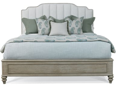
The Hickory White Bedroom Upton King Upholstered Bed 585-25 can be easily shared by a couple. It comes in a color that’s perfectly gender-safe.
Have you ever asked yourself what makes a home gender neutral? As more men and women take on professional roles outside of their home, work environments have become places where both sexes are treated equally. This fight for equality has transcended to the realm of interior design.
A few studies have written guidance on the factors that affect gender neutrality perceptions. From spatial and color association, these researches show how women and men react differently inside the same physical environment.
Through these studies, interior designers were able to accommodate the preferences of each sex, thus, they began using more neutral colors. Of course, it is impossible to reach a hundred-percent parity. More often than not, the deciding factor is whether the room or home would be used by a man or a woman.
Think of bars and clubs – places that appear to men more than women – and you’d default to black or navy blue, hues that are both associated with masculinity. But there is a need to thwart the predominantly male society. Gender equality has to invade interior design industry as well.
His and Hers
This is the era of gender revolution. The traditional roles for men and women are now being constantly challenged because of the astounding advances in technology and the sciences. The world’s various cultures are also evolving that gender is slowly becoming more fluid.
Gender is now no longer just male or female. This same concept is also happening in the world of fashion and interior design. And with a wave of feminism getting ever stronger, this solidarity is being initiated among men so they can foster gender equality in all aspects of life.
Gender neutral designs obscure what’s feminine and what’s masculine. Makeup and clothing lines reflect appearances that can get confusing. In interior design, though, it is all about being accommodated.
Okay, now let’s discuss the basics of a gender neutral habitat. It means letting go of anything that’s purposeless. This means setting up rooms with ample seating for everyone. This must be a gathering area that has neutral colors, a drop leaf table which can transform as a workstation when needed.
The entryway must also be adorned with both masculine and feminine features. Hang a pair of antlers just right above a lovely ornate chair. The walls in this area can be painted with a beige tone.
As you go inside the home and reach the living room, you can use darker tones in order to achieve a mood that’s bordering masculine but it’s held back just enough so a female can still thrive there.
Framed mirrors are also a necessity in gender neutral surroundings. These help bounce lights throughout the room. Correctly-framed mirrors can effectively play up the scale of a room. Paint the walls with dark gray and green and you’ll achieve a dramatic flair that’s neither too feminine nor too masculine.
And who says pastel pink or blue is just for females and boys, respectively? The key here is to make the major areas look gender neutral while you can inject these staple colors somewhere. Leave enough space for a reading nook inside the bedroom where a king-sized bed was replaced with a queen-sized one instead.
Bronze is also another gender neutral metallic color that can be used. Have the bed headboard upholstered with white silk linen then make it a tad more masculine by adding bronze nail heads.
If you don’t want to go wrong, you can simply use black and white. The bathroom can have black and white striped patterns then the rest of the design elements can be basic white.
Lastly, you can do soft fused with industrial sort of style. Use rustic elements together with iron and concrete.
Tags: gender-neutral colors, gender-neutral home, McCreerys, McCreerys Home Furnishings
Posted in Interior Design 101, Interior Design Elements | Comments Off on Not So Feminine, Not So Masculine: Creating the Gender-Neutral Home
Saturday, August 19th, 2017
What goes through your mind when you see accessories or furniture in black? This hue is often associated with mystery, authority, strength, power, and even fear. Black is formidable in many aspects especially since, to begin with, it is the presence of all colors.
But don’t think of black as something that denotes negativity, emptiness, gloom, grief or darkness. Black represents so many beautiful aspects of life such as sophistication, being sexy, and authority. This is why black is also used to denote other meanings such as a formal event (black tie event), pitch black (zero visibility), black belt (martial arts expert level), or black box (an airplane apparatus).
Other words that are associated with black include soot, raven, charcoal, lampblack, jet, ebony, ink, obsidian, midnight, sable, and onyx.
The Color Black and Your Mood
Black – just like other colors – can easily affect the mind and the body. It can boost confidence in one’s appearance when used correctly.
Black, admit it, is visually weighty, hence, it is very strong. Black can be overwhelming if you’re not careful when using it.
Hooker Furniture Living Room Melange Shiloh Cocktail Table: Black walls, black cocktail table, with touches of black on the artwork and table accessory; this room spells elegance on every level.
Black is an effective communication tool. Just look at how powerful black and white photographs are compared to the colored ones.
Black provides comfort and warmth or it can also cause feelings of animosity.
When Interior Design Is Mainly Black
When using black on interior design, be ready to surrender to this powerful hue. It is luminary, hence, the black candelabra will evoke more powerful emotions than the usual silver ones. Black can also reduce space which is why it is used mostly in large spaces that need to be tamed. When you have a small space, though, you might want to rethink about using black on your ceilings and walls.
When investing in black furniture, make sure that you have time to maintain it as it can show scratches and dust more visibly compared to all other colors.
Or black can be used to cap an otherwise bright, neutral, bordering boring look. The Flexsteel Dining Room Round Dining Table W1537-833 is the right contrast to this wide, open space.
Black + One Other Hue
There are many colors that can be combined with black. Would you want to know which one you need to use and where?
First off, the classic black and white. There you have it – it’s a classic combination that depicts elegance and dependability. Black and white spaces are quite popular these days which means many homes use this color mixture.
If you want to venture into something more exciting and unique, then you can hook up the color black with another striking color. An example is navy blue.
Black and navy blue look luxurious together. This pair will give your space a posh appeal especially when you add gray accents.
Yellow and black, on the other hand, is a dynamic fusion that is also elegant, stylish, and non-boring. Prepare to scatter your vision throughout a room with this color mixture.
For the more daring bunch, you can go for orange and black. This marriage of two colorful colors will give you a warm and cozy ambiance. Use orange accents or vice versa, either way, you’re sure to have an exciting home.
Silver and black have a tendency to make the room seem gloomy. To counter this effect, you can liven up your space by adding flowers and colorful accessories.
To unleash the lovely lady in you, use pink and black. This color combo is a huge favorite among female teenagers and even ladies who want to show their softer, more feminine side. For a more exciting fusion than this yet not straying from the look that says you’re a woman, you can always go for red and black.
Red and black screams strength and power. Use the latter as the effective background and red as the color for the furnishings.
Tags: black, black design, black furnishing, black interiors, McCreerys, McCreerys Home Furnishings
Posted in Color Schemes, Interior Design 101, Interior Design Elements | Comments Off on Back to Black
Friday, August 18th, 2017
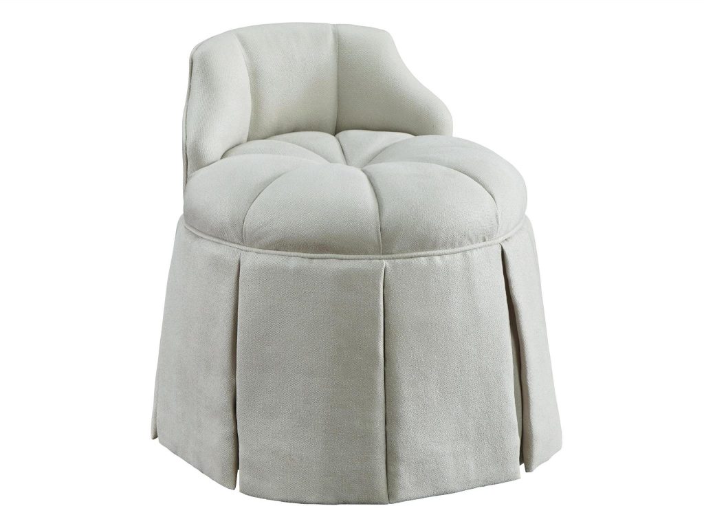
A lovely vanity is only as good as its lovely chair. This Chloe Vanity Stool from the Protege Collection is one such vanity chair.
Don’t you just love the idea of soaking in a hot tub after a long, tiresome day at the office? What could be more relaxing, right? But what would you do if the bathroom environment isn’t exactly spa-like? Here are some quick tips for creating a relaxing bathroom or toilet so that the next time you come home from the office, you’d have someplace else to go other than the bedroom –
Fragrances are a Must
A wonderful place to begin is by using scented candles or diffusing fragrant oils. No bathroom is relaxing without these essentials. Try rose and chamomile to soothe the senses. Try to buy some candles that have a complementary scent to your bath gel or body soap. This way, you won’t end up being confused with the different scents inside the room.
Other relaxing scents include ginger and spice, lavender, and any citrus oils (e.g. lime, wild orange, lemon, and bergamot).
Set Up Some Mood Music
To do this, you would need to have some speakers installed inside the bathroom. Since water and electricity must never mix, you should have a licensed electrician set this up for you.
The ceiling is one of the best places where you can install your bathroom speakers. Or you can have Bluetooth speakers set up on the sink while you’re in the tub. Just remember to have these removed once you’re going to use the sink once more.
Before you take a bath, create a playlist of the most soothing music that you can find. Press play then enjoy your bath.
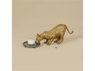
Maitland-Smith Bathroom Classic Finished Cast Brass Lion Soap Dish With Hammer Blue Shell Accents 1254-339
Use the Right Accessories
Of course, a relaxing, spa-like bathroom will only look and feel serene if it has the right accessories. Elegant accessories that every bathroom must have are –
Add according to your bathroom requirements.
Dress Up the Window
A bathroom with a window – especially one that looks out to a lovely scenery outdoors – is a blessing. Of course, you would need to dress up this window for a little privacy. You can have curtains hung just halfway up. If you’re feeling more adventurous, you can also combine draperies with balloon shades. There are also others that use shutters since these require very little maintenance.
Focus on Lighting
The most restful bathrooms have the correct kind of lighting. You should shun fluorescent lighting on the bathtub and shower areas as this will only make you feel more active (this is best used as a task light). Use it, though, on areas where you will brush your teeth, do your makeup and style your hair.
For bathing, general ambient lighting would do. Use dimmers so you won’t hurt your eyes on the ceiling lights that you install. For best effects, use wall sconces that are installed at eye level. This is the proper height to cast just the right amount of light that would show your facial features.
For decorative lighting, you can always rely on a chandelier to do the job. Make sure that the materials used on the chandelier complement the other design elements inside your lovely loo.
Tags: designer bathroom, McCreerys, McCreerys Home Furnishings, spa bathroom, spa-like bathroom
Posted in Accents, Accessories, Bathroom Design, Interior Design 101, Interior Design Elements | Comments Off on The Lovely Loo
Follow us on our social media
© McCreery's Home Furnishings | All Rights Reserved | Privacy Policy