- Follow us:


Friday, July 21st, 2017
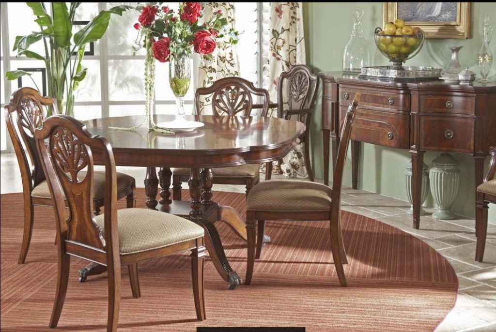
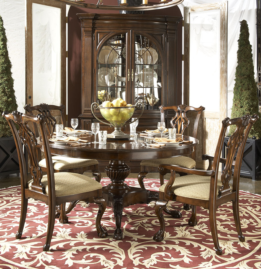
‘Notice the contrast of this Antebellum collection against the tamer backdrop?
There are many principles to talk about when discussing interior design. But when organizing and designing, it is a wonderful tool that you can use effectively. But, first, let’s define color contrast.
If you are to define contrast in interior design, this is the difference between two hues – that is all there is to it. When you’re building a webpage, though, it becomes an entirely different thing. You would want to have a high contrast between the background color and the text. High contrast between interior design elements could give a messy look. Yet black and white is the highest contrast that can be created.
Contrasting Colors
Colors may contrast in value, hue and saturation yet color theorists have come up with different kinds of contrasts through the years.
Hue contrast is as simple as saying high contrast or low contrast. This relates directly to the fusions on the color wheel. The farther each color is from each other, the higher their contrast becomes. Complementary colors have the highest contrast while the opposite is true with analogous color combinations.
A special contrast of hue is the so-called cool and warm colors. These depend much on how the eyes work. Warm colors appear closer while the cooler ones are more distant.
Contrast of value is best in the creation of bigger contrasts. Black and white is believed to be the highest contrast of value. Huge differences in lightness are pleasant to the human eye. Lower contrasts on value can be used on subtle differences.
Saturation contrast is best used in designing aspects that don’t require emphasis. Color sets with varying saturation that are set against a gray background, for instance, is seen as transparency. This is an interesting piece of design aspect.
Decide which part of your home you would like the color contrasts to take place. Imagine a pastel sofa surrounded by other pieces of furniture in jewel tones. These will make for a wonderful rendition of successful color combination.
You could be tempted to keep the walls white but try saffron instead. When combined with green tiles, the saffron wall would create a more interesting visual thing to look at.
Blue and reds, grays, oranges, greens and yellows can be combined as warm and cool tones. They can be used to balance the ambiance, to make cozy, or to create drama.
Contrast in Composition
When talking about color contrast, this generally refers to a number of color fusions yet it is not limited to these. Textures can also be contrasted with the right set of hands. Shapes can, too, though this is rarely done. If you want to start using shape contrasts at home, then you can look for geometric or boxier pieces and start mixing them with round or curvy pieces of furnishings.
Going back to colors, you can also add a pop of color to any colorless space so you can perk it up or give it a more interesting dimension.
Dark blue walls and turquoise blue may be close on the color scale but they can still appear different. These colors just prove that even almost similar colors can be perceived differently. This example of color combo can also be used as an exciting pop of color in a room where you would want some activity and increased productivity.
Juxtaposition is also about experimenting with visual interest. This means being comfortable in mixing lighter oak with walnut or granite countertops with walnut cabinets.
A Contrast Room?
When you want a bright, white home, having a dark more mysterious room might be a far out idea. Not in a home where contrast is being set up. How about having the guest room in dark color while the rest of your home swims in a lighter hue?
Tags: contrast, contrast in interior design, interior design contrasts, McCreerys, McCreerys Home Furnishings
Posted in Interior Design 101 | Comments Off on Interior Design Contrasts: Using Juxtaposition to Your Advantage
Wednesday, January 27th, 2016
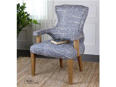
Living Room Uttermost Citographie Gray Linen Armchair 23168. This chair is made of hardwood and made perfect by craftsman detail right on the gray linen tailoring. See how the brass nails streamline the fabric trim giving the needed contrast to the solid oak bare frame.
Craftsman dwellings were inspired by architect brothers Henry Mather Greene and Charles Sumner Greene. These ingenious minds worked together during the 20th century in Pasadena, California. The Greenes were quite inspired by the English arts and crafts movement and Oriental architecture. In their own promoting handmade stuff rather than those created inside factories and were machine-made.
If you want to have a first-hand look at the beauty of craftsman design and architecture, you could visit Southern California where a few bungalows from 1905 till the 1920s still stand. You will surely love this style if you like things that may be old but have got a timeless appeal.
Characteristics to look for include gabled roofs, front porch, tapered columns, partly paned doors, multi-pane windows, and a lot of earthy colors.
Craftsman houses are typically painted in any nature-inspired color. You will see a lot of browns and greens. The low-profile homes often blend with their natural surroundings. The muted palette comprising of just one or two contrasting colors are used to highlight the breathtaking architectural features.
Regardless of the style that you choose for your home, keep in mind that painting an architectural feature with a contrasting color is an effective way to highlight such feature.
Another characteristic that is unique to a craftsman home is the stone detailing. See the mixture of different materials with the siding typically made of wooden clapboard. There are some that feature shingled siding as this was a pretty common style, too, back in the day. The foundations and porch piers are generally made of stone with some concrete block, bricks or stucco used at times.
Craftsman style also comes with roof eaves, exposed beams and rafter tails. All these reflect the influence made by the Arts and Crafts movement, thus, visible handiwork was featured and were considered in style.
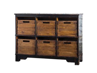
Living Room Uttermost Ardusin Hobby Cupboard 25589 is made from select hardwoods. It is hand-finished in worn black. The mahogany dovetail bins are solid wood and are great for your any storage needs.
Democratic Mixing
Get a craftsman style book and mix materials that you can get your hands on. Think of cladding a little addition of brick or stone even when your home already has existing clapboard siding. The addition of exposed rafter tails or beams should not mean that you are supposed to reconstruct your home or even replace your roof. Such details are commonly decorative in nature and can be easily added below a home that already has deep roof eaves.
There is something inviting and warm about a craftsman home. It celebrates the fusion of building materials, lovely structures, and most especially, the 20th century architectural features.
So, how to begin?
Start with a view of some of the craftsman homes still in existence. Take note of the window detailing, those exposed rafters, the facade, stained glasses as decorative accents, and the overall warm glow of the place.
Consider also the kind of lighting used which mirror the exteriors. Find sconce and pendant lighting that will cast a warm, golden glow throughout a room. While this is the general rule when it comes to craftsman homes (warm lighting plus earthy colors), this does not mean that you can’t put your own personality into it. You can opt for the bright home approach where you balance the bright hues with the wooden accents which are the staple materials of a craftsman home.
Other colors that you can add to your palette are white and blue. Gray can also give your craftsman home a contemporary appeal. Include white wooden accent pieces, modern pendant lighting fixtures, and some contemporary art. The result is a comfortable and trimmed yet modern and posh at the same time.
Isn’t it fun to make historical homes appear modern inside? This can be your take on retro meets the contemporary look.Craftsman design is sure to captivate both young and old spectators.
Tags: 20th century, 20th century chairs, arts and crafts, contrast, contrast in design, contrast in interior design, craftsman, exposed finish, hardwood, hardwood furniture, hardwood pieces, interior design contrasts, McCreerys, McCreerys Home Furnishings, mixing and matching furniture, pendant, pendant lighting, retro, Retro design, Retro style, tips, wall sconce, wooden elements
Posted in Furniture, Interior Design 101, Interior Design Elements, Interior Design Themes | No Comments »
Monday, January 25th, 2016
mix
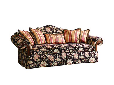
This sofa from the Fine Upholstery Collection of FFDM is oozing with eclecticism.
Imagine finding a streamlined L-shaped couch and a lovely shag carpet in the middle of your living room. These can provide the modern side to an eclectic home while any wooden piece will lend the eclectic vibe. The eclectic design is a spectrum of many different styles. It is the gathering of different elements coming from various sources then used together in perfect harmony. This style, however, is not an easy one to replicate more so to create. You need to learn to mix and match certain interior design and decorative elements coming from different themes.
Yeah, this is not as easy as it seems since taking different elements from your favorite styles and throwing them all together is not the way to go. So whether you will design a bungalow or a much wider space, make sure that you have an eye for balance and harmony. Now going back to that L-shaped couch and the wooden center table, such pairing will become acceptable if the background features neutral or any light-colored wall or floor-to-ceiling curtains.
Though you may like different elements separately, these may not look great when brought together. If you want to avoid creating design mess, then you have to be careful about your choices. Moderation is key to creating the contrasts that you need. Variety and contrasts, after all, are what comprise eclectic interior design.
What Strikes Your Fancy?
Think of eclectic as the union of the luxurious and simple; neutral and bright; even the East and the West. The leeway that you enjoy is what makes this whole design scheme tricky. Keep in mind that the borderline between chaos and acceptable contrast is very thin. The leeway that you enjoy is what makes this whole design scheme tricky.
Do you think you have the skill to mismatch something systematically? This is the very core of eclecticism. Find enough elements that will become the foundation. This common ground will be responsible for harmonizing everything else.
Any room, for instance, can showcase wooden furniture pieces that can give your home a rustic and earthy feel. Yet they could also turn out to be overpowering or monotonously boring if you do not use them carefully. Find decor pieces that will soften the overall look of your home (bright throw pillows or colorful area rugs for instance).
Don’t bother about matching chairs. Use a narrow palette and a dash of both shimmer and silhouette. Find artwork, accents, rugs, and lighting elements that play well with your background. Use light against the dark, flat and glossy, traditional and modern. Always look for prospects of creating analogous unions.
This inspiring dining set from the FFDM American Cherry Collection is a powerful anchor to the ornate carpet.
Another great rule of eclecticism is to edit as you go. It will be impossible to cram all your ideas in one room. As you go along, you will observe that finding the right balance becomes easier. Establish optical marriages of furniture and artwork, shapes and finishes, even focal point and accent pieces.
The fundamental pieces should serve as the anchor to your whole theme. Architectural elements can be repeated throughout, say, a gold-colored chair propped against a distressed white desk in your home office, all against pearly white painted walls, trim and door posts.
Before bringing any piece to a room, consider its relationship to the rest of the design elements. Will it overwhelm or become a dull addition? If this is so, then it is certain that your furniture piece should go someplace else.
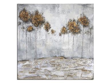
Accessories Uttermost Iced Trees Abstract Art 31304 is a frameless masterpiece that spells eclectic throughout. This artwork will surely leap to life in any room.
Scale, composition and proportion are always important when it comes to interior design, however, they become crucial the moment they are used in a home with incongruent design elements. Pay attention to the mixture of artwork and accessories as there should be nothing unintentional in your space.
Lastly, eclectic design is also about texture layering. Create depth by bringing in on Oriental carpet onto a wooden flooring and trim. Upholstery pieces look great when paired with sleek desks. Different textures can create visual sensations that will surely excite the senses.
Tags: contrast, eclectic, eclectic design, eclectic interior design, eclectic interiors, eclectic Safari theme, eclecticism, guidelines, interior design contrasts, match, McCreerys, McCreerys Home Furnishings, mixing and matching furniture, mixing designs, mixing interior designs, tips
Posted in Interior Design 101, Interior Design Themes, Interior Design Trends | Comments Off on Eclectic Design: Your Home, Your Style
Follow us on our social media
© McCreery's Home Furnishings | All Rights Reserved | Privacy Policy