- Follow us:


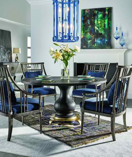
FFDM Candence: Notice the blue on the upholstery, lighting fixture and accessories – they leap from the backdrop.
Blue is one of the colors that are frequently referred to as people’s favorite. It is the representation of the beautiful skies and the pristine waters of many beaches. It may be rarely seen in fruits and vegetables but this is no less than the perceived color of heaven and serenity, hence, it is no surprise that a lot of corporations use this hue on their logos.
Blue is a cool, slow, even wet compared to the vibrant intensity of red. Blue also has contradictory meanings more than any other hue. Here are examples –
Most tints and shades of blue represent loyalty, trust, understanding and tidiness. What’s ironic, though, is that blue is also the color of depression in our country. Expressions such as feeling blue or singing the blues are examples of such notion.
Blue Trivia
There are many interesting facts about the color blue. First, it is the world’s number 1 favorite color. Also, about 53-percent of flags all over the world have blue in it. This is also the most used color in corporate logs, blue blood means you are an aristocrat, blue is the fundamental color for baby boys and, lastly, dark blue suits are the standard in professional business attire.
Blue also has few connections with the sense of smell or taste which is why it is an effective appetite suppressant.
Blue is almost in everything which is why you will never go wrong when you decide to use this as your color motif.
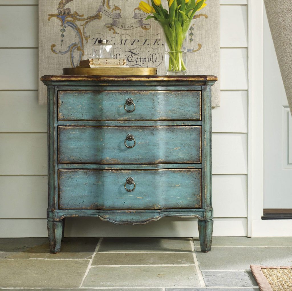
Hooker Furniture Living Room Three Drawer Turquoise Chest
Blue in Interior Design
Now that you know how important blue is, it’s time to consider how you’re going to use it in your home –
The Infamous Blue Door
Apart from red, blue is also an interesting color to use on your front door. Blue is perfect for a home with brick exterior. This door will surely stand out even with the delicious vision that bricks offer.
An exterior with mixed colors could do well with a darker blue door (almost to the point of being gray). The blue will act as a neutral hue that will ground the entryway.
Follow us on our social media
© McCreery's Home Furnishings | All Rights Reserved | Privacy Policy